27/08/19 - 24/09/19 (Week 1 - Week 5)
Atiqah Farzana Binti Syalleh Karimyee (0336740)
Digital Photography and Imaging
Exercises
INSTRUCTIONS:
Assignment Brief:
Week 1 (27/08/19)
Exercise 1:
Today we used Photoshop to do some basic editing of Dora the Explorer into the Hearst Mansion. Since I am still unfamiliar with Photoshop, it was a bit difficult and sometimes overwhelming when I could not do it properly. Nonetheless, I took home a lot of new knowledge such as:
- Mac shortcuts (command + shift + 3 = screenshot, command + t = free transform, command + shift + 4 = selection tool, etc. etc.)
- various ways to crop a picture
- how to add a shadow and reflection of a person
- using a basic mask
 |
| Fig. 1.1 Dora Movie Poster |
 |
| Fig. 1.2 Hearst Mansion |
 |
| Fig. 1.3 Dora in Hearst Mansion |
Week 1 (01/09/19)
As homework, we had to take a picture of ourselves and insert it into the Hearst Mansion. I thought it would be really interesting if I could edit myself sitting by the edge of the pool with my feet in the water.
 |
Figure 1.4 Me
|
I used the pen tool to crop out only my body, then I inserted it into the Hearst Mansion.
 |
| Figure 1.5 Transform |
 |
| Figure 1.6 Shadow and Reflection Layers |
 |
| Figure 1.7 Final Attempt |
Week 2 (03/09/19)
Exercise 2:
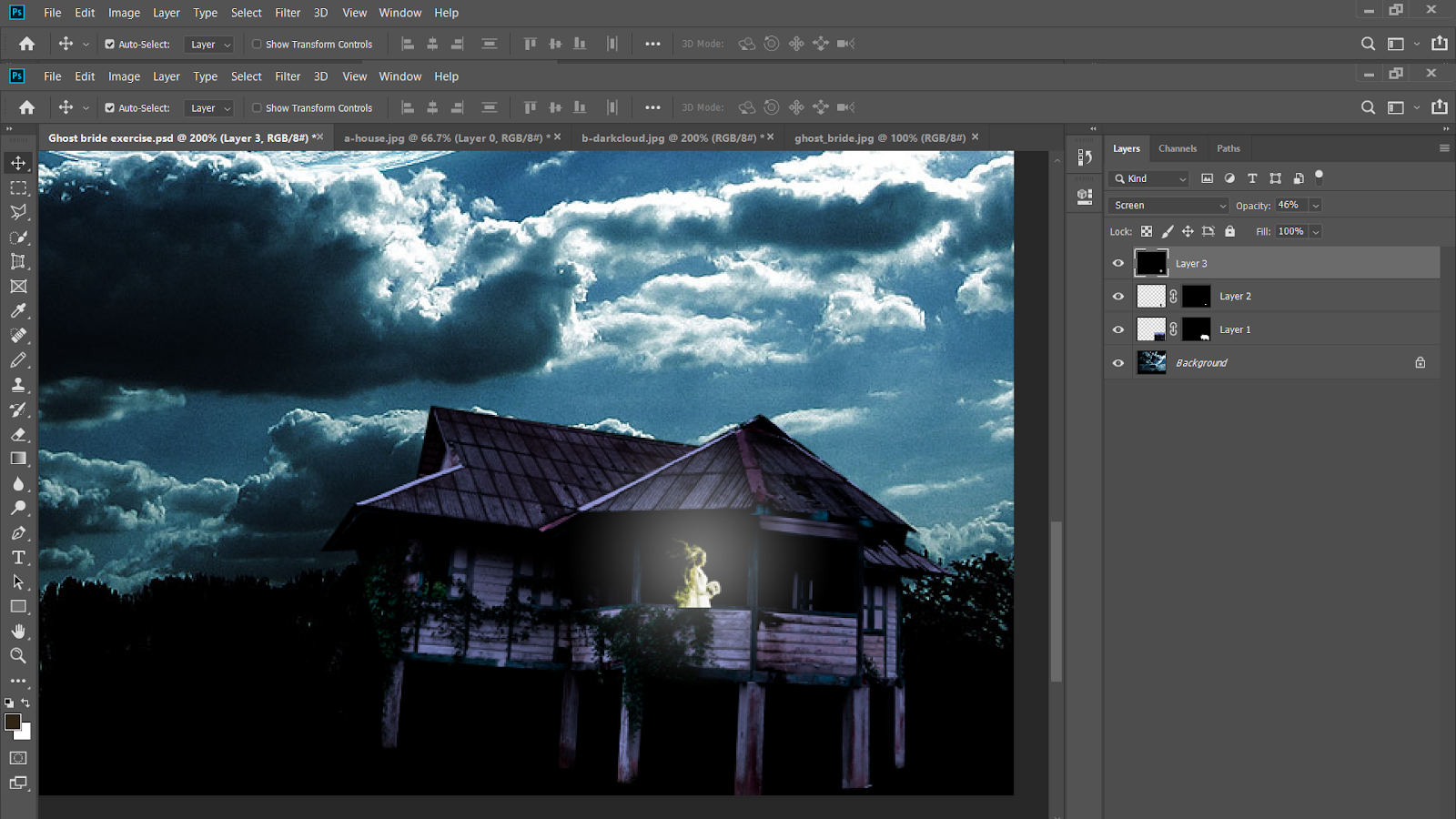
In today's class, we did a new exercise. A new set of pictures were given and we had to edit the dark night sky as the background of the old kampung house, with the ghost bride eerily hiding in it.
 |
| Figure 2.1 Old Kampung House |
 |
| Figure 2.2 Dark Night Sky |
 |
| Figure 2.3 Ghost Bride |
We edited it by following Mr. Jeffery's tutorial so we would not be too lost while doing it. The steps for this exercise is similar to the previous one- selection, mask, and colour match but we will be using new tools such as 'screen' and gradient.
 |
| Figure 2.4 Selection Tool |
 |
| Figure 2.5 Layers |
By using the quick selection tool, I cropped out the house and inserted it into the image of the dark clouds. Right now, the house looks very obviously out of place so I used colour match to make it blend in with the background.
 |
| Figure 2.6 Colour Match |
 |
| Figure 2.7 Ghost Bride |
I put in the ghost bride on a 'screen' effect so that the black background of the picture disappears and only the white figure is shown. After that, I cut off the lower part of her body so only her torso and head is seen from the houses' porch.
 |
| Figure 2.8 Gradient |
The gradient tool helped my easily achieve the radiant glow that is emulating from the ghost bride. I made it smaller and turned down the opacity to make it a subtle yet effective detail in my edit.
 |
| Figure 2.9 Final Attempt |
This exercise felt really fast and easy as compared to the first one, probably because I have had a few rounds of practice with Photoshop and that Mr. Jeffery guided us the whole way. Nonetheless, I felt very confident now and hopefully with more practice I will become better at Photoshop.
Week 2 (07/09/19)
Following up from this week's class, we did another exercise but were allowed to complete/ touch up at home. A set of images were given and we had the freedom to choose which one we wanted to do, and how creatively we wanted it to be.
 |
| Figure 2.10 Sunset |
 |
| Figure 2.11 House on Prairie |
 |
| Figure 2.12 Clouds |
I have already made an edit during class, but it was very boring and had little effort and no imagination. Here it is:
 |
| Figure 2.13 House Edit With Clouds |
I wanted to try to make something out-of-the-box and creative. As majority of the class was using the house and the clouds pictures, I decided to go for the sunset this time. I put some thought into it and I envisioned the house to be on a separate island, not on the existing one with the trees.
I selected a chunk of land from the existing island, smoothed out the edges and pasted it on the right side of the sea.
 |
| Figure 2.14 New Island |
 |
| Figure 2.15 House Selection |
 |
| 2.16 House on Island |
I inserted the house into the sunset image and I was already liking it so far. I turned down the brightness so that the house is almost a silhouette just like the trees in the back. I was struggling on trying to get the shadow/ reflection/ gradient of the house on the water. I decided to just make it very light and subtle because the trees did not have a clear reflection either.
 |
| Figure 2.17 Layers |
For the finishing touches, I added a few birds flying above the trees. (Actually, someone in class did this and Mr, Jeffery was very impressed so here I am, copying her work.) I mean, nothing really is original, right?
I added various different bird PNGs I found online and layered them, then erasing a few birds because I felt like it would be too much- and voila! Here is my masterpiece of a work:
 |
| Figure 2.18 Final Attempt |
I am very satisfied with the outcome, especially because I did it without any help whatsoever. Photoshop is starting to become more fun for me (I sort of hated it on the first day of class) but I really enjoyed taking my time with this one, despite juggling all my other work for this weekend. I am glad I went with this idea instead of just handing in my previous work. I hope this exercise made me want to do more edits and take them as something fun rather than schoolwork.
Week 2 (07/09/19)
Random Exercise
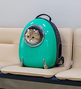
Mr. Martin posted a new exercise in the Google Classroom which was
optional, but the 3 most creative get extra marks. I thought, why not just try it out? I needed to practice anyways and hopefully mine is creative enough to score those extra points.
The goal is to edit the world famous Hosico cat into a creative setting. The first thing that came to mind was to put him on top of a roller coaster. I could not think of a better idea than that so I just went with it.
 |
| 3.1 Hosico Cat |
 |
| Figure 3.2 Roller Coaster |
There were plenty of better roller coaster pictures, but I needed one with an empty seat so that I could easily edit the cat in it. I tried editing it onto a fully seated roller coaster, but it was very challenging as it was difficult to edit the person out. I decided not to waste my time and just find a coaster with an empty seat to make my life a bit easier.
I flipped the cat picture horizontally so that it is now facing the right side. I also skewed it a bit so that it is facing forward more.
 |
| Figure 3.3 Edited Cat |
 |
| Figure 3.4 Layers |
 |
| Figure 3.5 Final Attempt |
I think that I did a fairly decent job, but I feel like the turquoise coloured backpack is still too bright and makes it look out of place. This is the best I could do and I hope I could get some feedback from Mr. Martin or Mr. Jeffery for this.
Week 3 (10/09/19)
Exercise 3:
In today's class, we learnt that:
- RGB is an acronym for Red, Green and Blue, and it is basically a way for colours to be displayed onscreen.
-CMYK is for print.
-a pixel is a small box that contains colour codes and makes up an image or video
-pitch black hex code is 000 because there is no colour in black
-white colour code is 255 because it is a mixture of all colours
Moving on, today's exercise was to turn a black and white photo into a coloured picture. This can be done by using multiple layer masks in Photoshop. Starting off, we all used the same black and white picture of an old man.
 |
| Figure 4.1 Black and White Picture |
Using the quick selection tool, I first selected the skin and masked it off. I clicked on 'solid colour' and chose a light skin colour. Immediately, the picture looks like it came to life.
 |
| Figure 4.2 Skin Colour |
With the same method, I continued to do this with all the other areas of the picture including eyes, hair, clothes and background, an even layering other colours ontop for a more realistic look.
 |
| Figure 4.3 Shirt and Hair |
 |
| Figure 4.4 Blush on Skin |
 |
| Figure 4.5 Final Attempt |
It was definitely challenging to find the right colours and tones that compliment each other. I also struggled in getting a smooth transition between the hair and the skin. To a certain degree, the picture seems a bit unrealistic, probably because I saw the black an white version of it first. Nonetheless, I think my attempt looks better than the one I did in class because I got to take my own time at it.
Our assigned task to do at home was to take any black and white picture and colourise it. I chose a picture of one of my favourite artists, Keith Haring.
 |
| Figure 4.6 Keith Haring |
As you can see, there is a black border around the original picture so I went ahead and cropped it out. I started off with the background using a medium blue colour.
 |
| Figure 4.7 Background |
Next, I used a few different shades of peach for the skin tone, as well as some blush to make it look more lively.
 |
| Figure 4.8 Skin Colour |
I tried to find the exact artwork on his shirt but I could not, so I resulted to just using primary colours which are very prevalent in his art.
 |
| Figure 4.9 Shirt |
 |
| Figure 4.10 Final Attempt |
I am quite happy with the end result, especially the colours on the shirt. However, the skin tone is still a bit weird and not quite right to me. Although compared to my previous attempts of practice, I can see that I got better at it than when we first did it in class.
Week 4 (24/09/19)
Exercise 4:
In today's class we learnt how to:
- edit a flag onto a textured fabric
- make a displacement map
- edit animal skin onto humans
- edit animal skin onto other animals
Firstly, we had to edit the Indian flag onto the textured fabric so that it could look more realistic and 3-Dimensional.
 |
| Fig. 5.1 Indian Flag |
 |
| Fig. 5.2 Textured Fabric |
The next step is to make a displacement map. The purpose of a displacement map is to apply texture to a flat graphic via the displacement file, and it will distort the graphic to conform to the shape of the map. In this case, I want the flag to have the same texture as the fabric.
I have to desaturate the fabric image first, then save it as a psd. file.
 |
| Fig. 5.3 Displacement Map |
I selected the flag and pasted it on the fabric picture (coloured, not the desaturated one). Then I had to displace it by going to Filter/ Distort/ Displace.
 |
| Fig. 5.4 Displace |
I put both the horizontal and vertical scale to just 5px so that the effect would not be too much. Next, I choose the displacement map file that I made earlier and immediately the flag looks very different from before.
 |
| Fig. 5.5 Displacement Map Added |
Because it looks very flat and the curves cannot really be seen, I had to change the layer effect to multiply. Although this made the curves much clearer, the middle part lost its white colour. To regain this, I made a new layer and added a new effect to make the white part clearer.
 |
| Fig. 5.6 Multiply Effect Added |
 |
| Fig. 5.7 Screen Effect Added |
I added a new layer with the 'screen' effect to regain the white part. I continued to adjust the opacity to make it look better.
 |
| Fig. 5.8 Layers |
 |
| Fig. 5.9 Final Attempt |
For the next exercise, we had to use the same technique but with a twist. We used the same picture of the black and white man that we used for the recolouring exercise, and had to use a snake skin ontop of his skin.
|
Fig. 5. 10 Black and White Man Picture
|
 |
| Fig. 5.11 Snake Skin |
Since the image of the man is already in black and white, there is no need to desaturate it; I just saved another copy as my displacement file. I adjusted the snake skin picture vertically so it covers the whole face and I masked it off.
 |
| Fig. 5.12 Displacement Map |
Using the brush with the colour black, I 'erased' the unwanted areas like his eyes, hair, jacket and background. Then I set the effect to 'multiply' and lowed the opacity.
 |
| Fig. 5.13 Final Attempt |
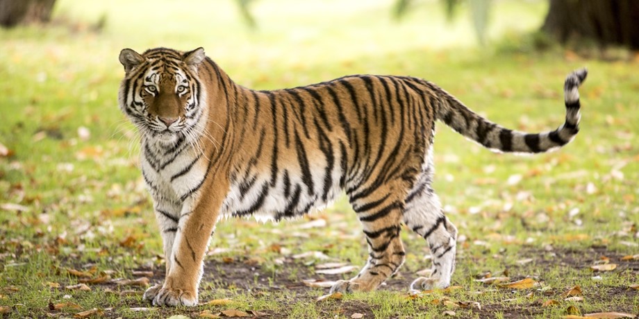
Next, we were told to take a skin from an animal and swap it with the skin of another animal.
 |
| Fig. 5. 14 Polar Bear |
I found two tiger pictures that have the same pose so it would be easier to edit.
 |
| Fig. 5. 15 Tiger 1 |
 |
| Fig. 5. 16 Tiger 2 |
I made the polar bear picture desaturated and saved it as my displacement map.
 |
| Fig. 5. 17 Displacement Map |
I a selected the body of the first tiger and masked it off. Then, I pasted it onto the polar bear, and added the displacement map.
 |
| Fig. 5. 18 Progress: Body |
 |
| Fig. 5. 19 Progress: Front Legs |
I thought the arm looked a bit weird, but I soon realised that the inside part of the polar bear's arms/ legs are more white as compared to the rest of their orange body.
 |
| Fig. 5. 20 Progress: Front Legs |
 |
| Fig. 5. 21 Progress: Hind Legs |
Again, I felt like there was something wrong with the hind legs for my tiger. The leg closest to me has a strange cut inbetween the stripes which I could not fix (after a long and painful half an hour of trying to). Also, the inside of the hind leg is more white than the outer part, thus making the polar bear a bit off-looking, to me at least.
 |
| Fig. 5. 22 Progress: Face |
 |
| Fig. 5. 23 Progress: Face |
I struggled A LOT with the face. A polar bear's face is much smaller and has a slight snout, whilst a tiger's face is bigger, wider and flatter. I struggled with getting the polar bear's eyes to show, because they are also very tiny and blended in with the stripes.
One ear is sort of hidden, which can only be seen if you look really closely.
 |
| Fig. 5. 23 Final Attempt |
In the end, I quite liked how it turned out, especially the body and the two font legs. I struggled a lot with the hind legs and also the face. Nonetheless, I am fairly happy with the outcome.
Week 5 (24/09/19)
Exercise 5:
Mr. Martin wanted us to create our own version of The Castle of the Pyrenees by Rene Magritte. The painting showcases a large floating boulder with a castle on top; the scenery is calm with blue skies and ocean waves swaying.
We were given the freedom to get as creative as we wanted as long as we have the boulder and a castle.
 |
| Fig. 6.1 The Castle of Pyreneess by Rene Magritte |
 |
| Fig. 6.2 Boulder |
 |
| Fig. 6.3 Neuschwanstein Castle |
 |
| Fig. 6.4 Pink Sunset |
Firstly, I flipped the boulder horizontally, making the flat part on top so I could put my castle.
 |
| Fig. 6.5 Boulder Flipped Horizontally |
Next, I masked off the castle and then placed it ontop of the boulder.
 |
| Fig. 6.6 Castle Added |
I added the trees and forestry as a separate mask because I wanted to resize it and also be able to change it's colour without messing with the castle.
 |
| Fig. 6.7 Trees Added |
 |
| Fig. 6.8 Background Added |
I placed the pink sunset as the background and I really like it! The only problem is the ratio of sunset to ocean, which looks very off at the moment. Also, I think that the grey colour of the boulder looks quite dull against the backdrop, so I used the match colour tool to make it more pink/ orange. However, the moss on the boulder also became pink, so I had to mask it off on its own and add it in again.
 |
| Fig. 6.8 Moss Masked |
 |
| Fig. 6.9 Layers |
I was basically done at this point, but I felt like my edit was very boring and had no 'wow-factor'. I decided to add in some dragons to spice up the picture. I added a radial gradient behind the dragons to make them look like they're glowing. The effect is really subtle, though.
 |
| Fig. 6.10 Dragons Added |
I changed the position of the dragons so one is slightly lower and the other is hovering over the castle, instead of both of them at the same level. I think this makes it look more dynamic.
I also felt like the dragons were not enough to make the edit look cool, so I added a lonely mermaid in the water. I
intended it to be a mermaid, but now it just looks like a normal human with pink hair.
 |
| Fig. 6.11 Mermaid Photo |
 |
| Fig. 6.12 Mermaid Added |
 |
| Fig. 6.13 Final Attempt |
I think the overall piece looks very cool and interesting, even though there are many basic elements that everyone has already included in their work (dragons, sunsets, mermaids etc.). I think that the overall composition of these elements is what makes the edit look nicer. I spent a long time on this so I think thats why I like it a lot; I took my own time to work on it even though I kept adding things spontaneously.


Comments
Post a Comment