 |
| Fig. 10.4 Clouds at Sunset |
With that I went ahead and did some sketching to lay out my compositions and ideas better.
 |
| Fig. 10.5 Sketches |
I sort of merged my first and second idea because it complimented well with each other. I wanted the cloud wall to act as a border as well as have random face parts to be added in my first idea. With that in mind, I went ahead and got started on Photoshop.
 |
| Fig. 10.6 Photoshop: Sky Erased |
I only wanted the clouds and forest so I removed the rest of the sky from the image. I then cut out my friend and added her ontop of the clouds. The black and white image sat in the background so it could still be seen but won't be too distracting.
 |
| Fig. 10.7 Photoshop: Black and White image added |
The tedious part was cutting out the colourful circles from this art installation.
 |
| Fig. 10.8 Photoshop: Colourful Circles Added |
 |
| Fig. 10.9 Photoshop: Colourful Circles Fully Added |
I pondered for a long time on what words I wanted to include in my work. I figured that it was best to make it something related to the art installation. At first I thought "be aware of your surroundings" was a good message, but it seemed a bit too overused and boring. In the end I decided to change it to"be aware of your feelings!" because it just spiced up the phrase a bit more, and still remained relevant to the art installation.
I used these cutout letters to form the phrase because I felt like it would look much nicer than using a normal font.
 |
| Fig. 10.10 Cutout Letters |
 |
| Fig. 10.11 Cutout Letters 2 |
|
| Fig. 10.12 Photoshop: Words Added |
 |
| Fig. 10.13 Photoshop: Face Parts Added |
 |
| Fig. 10.14 Final Attempt |
I really like the end result! I must admit it looks very collage-esque like it was done traditionally and not on Photoshop. I still like it a lot, though. I think the contrast of the black and white background against the colourful circles makes it very pleasing to look at- despite being a very busy composition. The face parts also refers back to the artist statement about being "mindful of the sounds, smell, temperature and feeling of the space".
Ms. Sherry said that it was very interesting and creative how I made use of the colour in this piece. She thought it was a self-portrait at first, but I can see how she thought that. I think that If I made the subject as myself, it would be quite a nice self-portrait for my first project. Ms. Sherry also commented on the use of typography and the overall composition, which she said she liked. She said that it was not necessary to know about the meaning behind the art installation, but I think it played a big role in the work as I based it entirely off of the installation. Nonetheless, I'm glad I received positive feedback on my work.
Week 8
(24/10/19)
Ilham Gallery Trip
As our next class was scheduled on a public holiday, we went on an art gallery trip to make up for it. I have never been to the Ilham Gallery before, but it was really nice and exceeded all my expectations.
All of the artworks were very interesting and I felt more aware of the political and social issues that the art was about. There were not a lot of art pieces, so I made sure to read through every artist statement. A majority of them were about personal trauma, politics or social problems, which were very deep and meaningful topics to absorb. I felt really moved by some of the artworks, and I think that is exactly how every artist wants their art to impact their viewers.
 |
| Fig. 9.1 Untitled by Sopheap Pich |
 |
| Fig. 9.2 "Come Join Our Thrillin' Supper" by Indieguerillas |
 |
| Fig. 9.3 "Tak Kunjung Padam" by Muhammad "Ucup" Yusuf |
 |
| Fig. 9.4 "The Follower" by Mella Jaarsma |
 |
| Fig. 9.5 "Storm Conqueror (Penakluk Badai) by Nyoman Masriadi |
 |
| Fig. 9.6 "Dad" by Lauren Forster |
 |
| Fig. 9.7 "Mum" by Lauren Forster |
These two photographs captured my eye, and when I read the artist statement I was very saddened by the pictures even more. The portraits are of the photographer's parents- right after they had received news that her mom's cancer had spread to her brain. Her mother was feeling especially lonely at this moment in time, as no one else understood what she was going through. Her father was also in immense pain to hear his wife's state, and the inevitability of losing his soulmate, best friend, and significant other.
Here are some more pictures of the gallery trip.
Here is my essay on a few design principles that I spotted whilst at the Ilham Gallery:
Week 8
(14/10/19)
Lecture: Harmony, Rhythm, Movement
Harmony refers to the visually satisfying effect of combing similar or related elements. It can be achieved in 4 ways:
- adjacent colours
- similar shapes
- rhythm
- repetition
 |
| Fig. 8.1 Adjacent colours |
 |
| Fig. 8.2 Similar Shapes |
 |
| Fig. 8. 3 Rhythm |
 |
| Fig. 8. 4 Repetition |
There are various types of harmony:
Harmony by unity is when all parts of a design or composition is related to an idea. The design is unified and has a consistency of style thus creating a sense of wholeness.
 |
| Fig. 8. 5 Harmony by Unity Example |
 |
| Fig. 8.6 Harmony by Unity Example 2 |
Harmony by variety contains different elements and materials to create a sense of diversity and life to the design.
 |
| Fig. 8.7 Harmony by Variety Example |
 |
| Fig. 8.8 Harmony by Variety Example 2 |
Unity + variety (effectively combined) = Harmony
 |
| Fig. 8.9 Unity and Variety |
Rhythm is the regular spacing of visual elements. It does not have to be continuous, as long as it repeats. Repetition of similar shapes and lines but with variation allows for a visual change that our eyes are attracted to.
Regular rhythm follows the same intervals over and over again.
 |
| Fig. 8.10 Regular Rhythm Example |
 |
| Fig. 8.11 Regular Rhythm Example 2 |
Random rhythm contains repeating elements without specific regular intervals.
 |
| Fig. 8.12 Random Rhythm Example |
 |
| Fig. 8.13 Random Rhythm Example 2 |
Alternating rhythm is repetition of more than one element in design.
 |
| Fig. 8.14 Alternating Rhythm Example |
 |
| Fig. 8.15 Alternating Rhythm Example 2 |
Flowing rhythm has elements that repeat following bends, curves and undulations.
 |
| Fig. 8.16 Flowing Rhythm Example |
 |
| Fig. 8.17 Flowing Rhythm Example 2 |
Progressive rhythm is when a characteristic of a motif is changed as it repeats.
 |
| Fig. 8.17 Progressive Rhythm Example |
 |
| Fig. 8.18 Progressive Rhythm Example 2 |
Rhythm contains 3 main elements which is
repetition, pattern, rhythm.
Repetition is an element being used or repeated over and over again.
Pattern is a combination of elements or shapes repeated in a recurring and regular arrangement.
Rhythm is a combination of elements repeated but with variation.
Movement occurs when our eyes follow through an artwork. It can be created by placement in composition (shapes, colours, lines, textures, patterns etc)
 |
| Fig. 8.19 Movement Example |
Fig. 8.19 shows a picture of a tram platform. The bystanders are clear because they are not moving. The tram is moving, thus creating a blurred effect in the picture. The person closest to the camera is also blurred, either because he is not in focus or walking too fast. The direction of movement is unclear due to the tram being able to move in either direction, but the man is most definitely walking to the right.
A motif is the repeating element that acts as a guide through the composition. In order to create movement through rhythm, an artwork must have a motif. Our eyes move from one example of the motif to the next, The amount of space between manifestations of the motif set the temp or speed at which our eyes move around the composition.
Movement can be created in 4 ways:
- rhythm
- lines
- colour
- illusion
Rhythm - Visual rhythm is created by created repeating shapes (a pattern), lines, colours, or any other visual component.
 |
| Fig. 8.20 Rhythm in Movement Example |
Lines - dynamic lines imply movement. They are often diagonal to the edges of the picture plane and may zig-zag or become sweeping curves.
 |
| Fig. 8.21 Lines in Movement Example |
|
Colour - a high key colour is both light in value and strong in chroma (intensity). A low-key colour is both dark and dull. The high contrast juxtaposition of these colour types is louder and busier than a picture of limited key-range.
 |
| Fig. 8.22 Colour in Movement Example |
|
Illusion - movement is created through repetition and contrast. The image below has a pattern which is very hard to rest your eyes on, thus making the viewer move their eyes around the picture which creates movement.
 |
| Fig. 8.23 Illusion in Movement Example |
|
 |
| Fig. 8.24 Illusion in Movement Example 2 |
|
The triangles are bigger at the bottom left corner of image Fig. 8. 24, and they get smaller when they curve upwards.
I was sort of anticipating to do collage when we first did the recycled materials piece, and now when I was finally able to use them I didn't really have a clue on what to do.
There was this large advert on a newspaper that looked very interesting so I decided to work my piece around it. Of course I forgot to take a picture of it but I found the same picture online:
 |
| Fig. 8.25 Newspaper Advert |
|
I sketched out some possible compositions and varieties to see which I could use. I ended up going with the bottom right corner sketch. It combined the picture of the woman and the moving triangles.
I basically cut out most of her shirt and parts of her face and hair, but I left her hand and mainly an outline of her body. After this, I started working on the background.
Fig. 8.24 showed a lot of triangles moving from left to right, so I wanted to use that to portray movement in my piece. I started cutting out triangular shapes of brown paper to fill up the white space of the paper.
 |
| Fig. 8. 27 Brown Triangle Pieces |
 |
| Fig. 8.28 More Brown Triangles |
I cut out smaller triangle pieces to make the movement aspect of my piece clearer (left to right).
 |
| Fig. 8.29 Smaller Triangles for Movement |
I pasted the woman ontop of the triangles. Her head actually cuts off awkwardly so I head to put it at the very top of the paper, leaving her arm to cut off at the bottom. I don't really mind it, though.
 |
| Fig. 8.30 Woman Cutout Added |
 |
| Fig. 8.31 Final Piece |
For a finishing touch, I added some random letters and covered up her watch with the same newspaper cut-out as the triangles.
I think it turned out pretty nice! Ms. Sherry said that she could see some gestalt in the woman. She was kind of upset that I covered up the watch because they hold very powerful meanings in design. I think I like the covered up version better, though.
During the critique session, someone guessed that the message of this piece is that the woman has a lot on her mind, and she is trying to drown it out with music. I did not really think of a message whilst doing my work, but I can totally see how he would come up with something like that. The woman's position makes it look like she is holding/ covering her ear like she has earphones on. Moreover, the small triangles can be seen in her head to show her negative thoughts. Also, the very tiny letters that are floating about can also represent thoughts or lyrics.
I think I should be more aware of having a meaning to my work instead of just making it for the sake of doing so. I noticed a few of my classmates have a clear message that they portrayed well in their work, and I think I should try to do the same as well.
Week 7
(07/10/19)
Today's lecture was on dot, line, scale and size.
A dot is the simplest element of drawing and the smallest unit we can draw. It is used as the starting position of a design such as line and shape.
"Dots and lines are the main ingredients of art."
There are various ways of using dots in design; here are a few:
 |
| Fig. 7.1 Dots in Design |
Pointillism is a technique of using small dots or large dots to achieve various effects. This can be done in various mediums such as paint, pen, pushpins, bottle caps, pebbles, etc.
Fig. 7.2 is titled "A Sunday Afternoon on the Island of La Grande Jatte" by Georges Seurat who was a pioneer for pointillism in the 1880s. This painting uses very small dots to achieve a realistic effect once the viewer sees the 'bigger picture'.
 |
| Fig 7.2 Pointilism in Painting |
Fig. 7.3 uses larger, uneven dots to create a painting of a man. The viewer is still able to see the painting from afar, but it is not as seamless as Fig. 7.2 is. The dots in this painting can be considered random and overlapping.
 |
| Fig. 7.3 Pointillism in Painting 2 |
 |
| Fig. 7.4 Pointillism in Pen |
 |
| Fig. 7.5 Pointillism Using Crayons |
I think Fig. 7.5 is interesting because the artist did not simply use crayons to create pointillism, but rather they arranged the crayons in such a way that it forms a woman's face from the top view.
Line is a series of points adjacent to each other. It is an element of art used to define shape, contours and outlines, or even suggest mass and volume.
There are definitely more different types of lines but here are several:
 |
| Fig. 7.6 Different Lines |
"Dots are about position. Lines are about movement and direction."
 |
| Fig. 7.7 0D, 1D, 2D, and 3D Lines |
There are limitless textures that can be achieved using just dots and lines. Here are several of them:
 |
| Fig. 7.8 Line Textures |
There is a form of line art where the artist uses only one continuous line stroke to create the entire piece. This takes a lot of careful planning and practice for the lines to end up in the right places. Fig. shows a very minimal style of line art, whilst Fig. shows a messier, complicated style.
 |
| Fig. 7.9 Minimalist Line Art |
 |
| Fig. 7.10 Complicated Line Art |
Fig. 7.11 shows a cross hatching technique which essentially is just using lines to create darker areas for shadows. Overlapping these lines will create darker areas and also textures.
 |
| Fig. 7.11 Cross Hatching Technique |
Scale is the size of an object in relation to the other objects in a design or artwork. Bigger elements are obviously emphasised more than the smaller objects, and it creates a new perspective for the design.
 |
| Fig. 7.12 Dot in Scale |
Life-sized is when the object is designed in the same size as the actual thing. For Fig. 7.13, the grandma (left) has crotcheted herself and her dog in life-size.
 |
| Fig. 7.13 Life-size Example |
Oversized is when an object is larger than how it normally is. The rubber duck in Fig. 7.14 stands at about 18 metres tall and has been in the various harbors of Toronto, Hong Kong, Sydney, Seoul and many more cities.
 |
| Fig. 7.14 Oversized Example |
Miniature is when an object is smaller than its normal size. Fig. 7.15 shows an astronaut carving out of a pencil lead.
 |
| Fig. 7.15 Miniature Example |
Enormous is when an object exceeds the usual bounds or accepted notions. Takashi Murakami's "EGO" exhibition showcases a gigantic sculpture of himself. I think the enormous realistic sculpture of himself paired with the title "EGO" is how he wanted to portray his ego, except Murakami is a very humble designer who is well respected in the art scene as well as the fashion scene.
 |
| Fig. 7.16 Enormous Example |
Here is a picture of the sculpture next to an average person.
 |
| Fig. 7.17 Enormous Example in Scale |
It's always a bit difficult to come up with an idea on a whim right after learning about a topic (and having to implement that particular topic into the art piece). I went onto Pinterest as I always do and found a lot of those continuous line drawings which I mentioned earlier in Fig. 7.9 and Fig. 7.10. I did not really feel like doing that, but I did come across some flower illustrations. I thought that the lines on the petals were really textured and nice so I decided to try to do it.
 |
| Fig. 7.18 Flower Inspiration from Pinterest |
Ms. Sherry told the class that it's not very creative to simply find a picture of something and draw it exactly as it is. I thought of changing the composition to fill up the whole page and for all the flowers to be facing upwards so all the petals can be seen.
I thought it would be fairly easy to do so I immediately started sketching it onto my paper rather than in my sketchbook.
 |
| Fig. 7.19 Sketch |
I then used a brush pen to outline everything.
 |
| Fig. 7.20 Inked Sketch |
I initially wanted to do my piece in just black and white, but Ms. Sherry said that I should put some colour in it and so I did. I used some gold paint on the middle part of the flower just to give it a pop of colour.
 |
| Fig. 7.21 Gold Paint Added |
I kind of wanted to do another piece because I felt like the flowers were a bit too simple. For my next one I thought of using dots as my main subject.
 |
| Fig. 7.22 Sketch |
I plan on using watercolour for this, but I haven't found the time to do it. :'(( I will update the finished piece soon.
Week 6 (01/09/19)
Topic: Alignment, Hierarchy, Direction, and Perspective
Alignment is the placement of visual elements so that they line up in a composition.
It is used to:
- organize group elements
- create balance
- create structure
- create connections between elements
- to create a sharp and clear outcome
The two principles of alignment are
edge alignment and
center alignment.
 |
| Fig. 6.1 Edge Alignment |
 |
| Fig. 6.2 Center Alignment |
 |
| Fig. 6.3 Good Alignment |
 |
| Fig. 6.4 Bad Alignment |
When the visual elements are aligned, the composition is clear, confident, formal, and elegant. The grids are invisible and does not have to have to literally be in the design.
Mixed alignment makes a design look more playful and dynamic if it was intended.
 |
| Fig. 6.5 Mixed Alignment |
 |
| Fig. 6.6 Simple Alignments |
 |
| Fig. 6.7 Complex Alignments |
Grids can help in alignment by creating an invisible structure or guideline on which the visual elements or text can be placed on. The more grids there are, the more complex the design can be.
Hierarchy is the visual information in an arrangement to imply importance. It is used to:
- add structure
- create visual organisation
- create direction
- add emphasis
- help a viewer navigate and digest information easily
"Establishing clear visual hierarchy is important because it holds a design together. Used effectively, hierarchy can make a complex message simple."
Hierarchy in scale is present when a design uses thickness to measure importance. In Fig. 6.8, the flow of importance starts from the top where it is very thick, and gradually gets thinner to become less important.
 |
| Fig. 6.8 Hierarchy in Scale 1 |
 |
| Fig. 6.9 Hierarchy in Scale 2 |
 |
| Fig. 6.10 Hierarchy in Scale Example |
 |
| Fig. 6.11 Hierarchy in Colour |
The thinnest line at the bottom is the darkest, which gradually goes upwards in colour where the thickest line is the lightest colour. Even though the strokes are larger above, the bottom strokes are deemed bolder, stronger and appears closer to the viewer.
  |
| Fig. 6.12 Hierarchy in Contrast 1 Fig. 6.13 Hierarchy in Contrast 2 |
The examples in Fig. 6.12 and 6.13 show hierarchy in contrast. Basically, the darkest colour stands out the most when surrounded by lighter colours.
Hierarchy in space allows elements to appear closer to the viewer if it is overlapped over another element. In Fig. 6.15, the darker object is not closer to the viewer although it is darker. Moreover, the lighter object above it has a shadow, thus emphasising on the space between it and the darker object,
 |
| Fig. 6.14 Hierarchy in Space 1 |
 |
| Fig. 6.15 Hierarchy in Space 1 |
Hierarchy in depth wants the viewer to focus on the clearest object, leaving the blurry, lighter objects as much further as they seem.
 |
| Fig. 6.16 Hierarchy in Depth |
Hierarchy in perspective has all the elements arranged which puts the flow of hierarchy to start from the darkest (closest to the viewer) to the lightest element (furthest).
 |
| Fig. 6.17 Hierarchy in Perspective 1 |
 |
| Fig. 6.18 Hierarchy in Perspective 2 |
"In design, depending on the simplicity or complexity of the intended message, hierarchy in design can exist in multiple forms and compete against each other at the same time."
Direction is a basic element in design that guides the viewer's eyes from an area to another. The three types of direction are:
 |
| Fig. 6.19 3 Types of Direction |
Horizontal direction is from left to right and vice versa. Designs with horizontal lines give off a calm vibe, promotes stability and tranquility.
 |
| Fig. 6.20 Horizontal Lines Example 1 |
 |
| Fig. 6.21 Horizontal Lines Example 2 |
Vertical lines go from up to down and vice versa. This effect gives a feeling of balance, formality and alertness.
 |
| Fig. 6.22 Vertical Lines Example 1 |
 |
| Fig. 6.23 Vertical Lines Example 2 |
An oblique direction is a slanting direction. This suggests movement or action.
 |
| Fig. 6.23 Oblique Lines Example 1 |
 |
| Fig. 6.24 Oblique Lines Example 2 |
Perspective indicates depth in a two-dimensional image. The two types of perspectives are linear perspective and non-linear perspective.
Linear perspective uses lines to show the illusion of depth in a picture. The three types of perspectives include the one-point perspective, two-point perspective, and three-point perspective.
Fig. 6.25 shows a one-point perspective drawing of a hallway which uses a single point to create illusion of depth.
 |
| Fig. 6.25 One-Point Perspective |
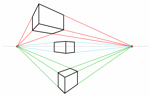 |
| Fig. 6.26 Two-Point Perspective |
The two-point perspective creates a more realistic look, include vanishing points outside the drawing.
 |
| Fig. 6.26 Two-Point Perspective Example |
The three-point perspective has a third point which is either above or below the drawing. This perspective helps the artist to convey the illustration of height in their artwork.
 |
| Fig. 6.27 Three-Point Perspective |
Fig. 6.28 shows an example of a three-point perspective drawings from a bird's eye view which is essentially just a top view. Fig. 6.29 shows another example of this perspective but from a worm's eye view (bottom angle).
 |
| Fig. 6.28 Three-Point Perspective Example (Birds Eye View) |
 |
| Fig. 6.29 Three-Point Perspective (Worms Eye View) |
The nonlinear perspective is a technique of depicting volumes and spatial relationships on flat surface. The three types of nonlinear perspective are size variation, colour, and value.
Size variation in art makes smaller objects look farther away in the distance in the distance, while larger objects look closer. In Fig. 6.30, the palm leaves are very large, making it appear closer; the boat and mountains in the back are far, which makes them smaller.
 |
| Fig. 6.30 Size Variation Examples |
Bright colours appear like they are closer to the viewer while neutral colours appear farther away.
 |
| Fig. 6.31 Colour Perspective Example |
Perspective in value makes lighter values look like they are farther back and darker values look like they are closer.
 |
| Fig. 6.32 Value Perspective Example 1 |
 |
| Fig. 6.33 Value Perspective Example 2 |
This week we had to use recycled/used materials for our new piece. I brought a lot of random things because I was unsure on what to do. I had a broken magnifying glass handle (the glass is gone, I only had the handle) which I really wanted to use so I started sketching out possible compositions and designs with it.
 |
| Fig. 6.34 Ideas Sketches |
I kind of liked the last sketch at the very bottom, with the person being abducted which is magnified. I decided to use it and started sketching it out on my paper.
 |
| Fig. 6.35 Sketch on Paper |
For the three aliens in their spaceship, I used this card from a game which I never knew how to play because all of the instructions were in Japanese. This particular card had a lot of green leaves on it which I thought would look nice for the alien's body.
 |
| Fig. 6.36 Game Card |
 |
| Fig. 6.37 Alien Cut-Outs |
I was uncertain on what materials to use for the spaceship. My friend brought these satay sticks and I used her leftover pieces to form the spaceship.
Ms. Sherry also brought some of her own recycled materials and shared it with the class, I took a strip of clear sheet which I then used for the glass/ screen of the spaceship.
 |
| Fig. 6.38 Spaceship Completed |
I sneaked in some gold paint to make a gradient of the light rays, adding some white string on the sides as an outline.
 |
| Fig. 6.39 Gold Light Rays |
Initially, I wanted to have a person being abducted by the aliens until I came across this card. It has a beetle happily marching while playing the drums and I thought it would look pretty funny in replacement for the dying person.
I also ripped pieces of newspaper, brown paper and the leftover pieces of the card as the background.
 |
| Fig. 6.40 Game Card |
 |
| Fig. 6.41 Newspaper Background |
I felt like the gold rays were a bit too bland so I added in these game chips. I do not remember the name of the game but this is what it looks like:
 |
| Fig. 6.42 Game with Coloured Chips |
I just used the yellow pieces to add some extra texture into the gold rays. There was also one random yellow flower-looking piece which is not from the same game but I decided to use it anyways. I think it added a pop of colour to the bottom of the rays which does not have any gold on it.
I also had a few chocolate wrappers which were golden, so I cut those up into triangles and pasted them around the aliens.
 |
| Fig. 6.43 Final Attempt |
I surprisingly like how my piece turned out! I think it looks very playful and funny because of the happy beetle being abducted. I did not really have a message for this piece but I had fun making it.
The rules I used for this piece was vertical direction and colour perspective. The UFO and light ray is placed vertically on the center of the paper. Yellow/ gold is the most prominent colour which stands out in the piece.
Week 4 (16/09/19)
Topic: Pattern, Repetition, Surface, Texture
Pattern is a repetition of more than one design.
 |
| Fig. 4.1 Pattern Example 1 |
 |
| Fig. 4.2 Pattern Example 2 |
The four types of patterns are:
- Meandering
- Branching
- Spiral
- Packing/Cracking
A meandering pattern is built on the repetition of an underlying line.
 |
| Fig. 4.3 Meandering Pattern Example 1 |
 |
| Fig. 4.4 Meandering Pattern Example 2 |
A
branching pattern moves outwards from a single point, just like a tree branch.
 |
| Fig. 4.5 Branching Pattern Example 1 |
 |
| Fig. 4.6 Branching Pattern Example 2 |
A
spiral pattern swirls out from a point, winding continuously as it gets bigger (or smaller).
 |
| Fig. 4.7 Spiral Pattern Example 1 |
 |
| Fig. 4.8 Spiral Pattern Example 2 |
Packing and cracking is when a pattern is deformed and starts to 'crack'. It refers to the way in which compacted cells define each others shape. A densely packed cluster of mushrooms will grow together, deforming the circular form of each cap because of crowding. In the same way a cluster of soap bubbles deforms each bubble from the perfect sphere of the isolated bubble, according to rules that govern the surface tension of soap bubbles.
 |
| Fig. 4.9 Packing and Cracking Example 1 |
 |
| Fig. 4.10 Packing and Cracking Example 2 |
Certain surfaces (like mud or old paint) that shrink may experience cracking, resulting in similarly cellular patterning.
 |
| Fig. 4.11 Packing and Cracking Example 3 |
Repetition is when something is said or done again and again. In terms of art, repetition can be used in the form of:
 |
| Fig. 4.12 Repetition in Art |
Repetition is used to build a sense of tension and helps us understand every piece of detail in a design. It does not only help us understand the art visually, but provides a deeper meaning to the artwork beyond the surface.
 |
| Fig. 4.13 'Dollar Signs' by Andy Warhol |
Repetition is a very prevalent aspect in Warhols artwork. In this particular piece, he states that "big-time art id big-time money" as he bluntly prints the sign for money as an artwork. Warhols art often reflect on the world's economy, capitalism and consumerism- and this is essentially what the multiple dollar signs are trying to show.
 |
| Fig. 4.14 "Golconda" by Rene Magritte |
The surrealist painter Rene Magritte wanted to show how reality is depicted differently from one person to another. From afar, every single man is the same- same clothes, body and style- but upon closer inspection their faces actually differ from one another. The repetition of men falling (or floating) makes this piece so unrealistic, despite the setting being very plain with regular buildings and a blue sky.
 |
| Fig. 4.15 One VS. Many |
When there is just a singular subject in an art piece, it may seem lonely, empty, and lacks feeling.
With the same subject, but now repeated, it appears to be abundant and out of control. Neither of these are wrong or right. Depending on what the artists' vision is, they may go with whichever would best suit their message.
The two types of repetition are
regular and
irregular.
Regular (or even) repetition is usually symmetrical and arranged orderly.
 |
| Fig. 4.16 Regular Repetition Example 1 |
 |
| Fig. 4.17 Regular Repetition Example 2 |
Irregular (or uneven) repetition is unbalanced in shape or arrangement, making it not smooth.
 |
| Fig. 4.18 Irregular Repetition Example 1 |
 |
| Fig. 4.19 Irregular Repetition Example 2 |
Moving on,
texture is the element of art that refers to the way things feel or look as if you could actually touch it. It can either be in 2D or 3D and there are three different types of textures:
- Physical texture
- Visual texture
- Hypertexture
Physical texture (tactile texture) are patterns or variations upon a solid surface.
 |
| Fig. 4.20 Physical Texture of a Tree Bark |
 |
| Fig. 4.21 Physical Texture of a Seashell |
Visual texture (implied texture) is the illusion of a 2D design having a physical texture. There are three categories of this texture:
Decorative, spontaneous, and
mechanical.
 |
| Fig. 4.22 Visual Texture (Decorative) |
 |
| Fig. 4.23 Visual Texture (Spontaneous) |
 |
| Fig. 4.24 Visual Texture (Mechanical) |
Hypertexture can be defined as a realistic stimulated surface texture produced by adding small distortions across the surface of an object.
 |
| Fig. 4.25 Hyperexture Example 1 |
 |
| Fig. 4.26 Hyperexture Example 2 |
Texture in painting refers to the look and feel of a canvas based on the paint, the application, or the addition of other materials. The four types of texture include:
- Actual texture
- Stimulated texture
- Abstract texture
- Invented texture
Actual texture is a combination of how the painting looks and feels when touched. A heavy buildup of paint such as the impasto effect, or the addition of other materials can enhance this texture,
 |
| Fig. 4.27 Actual Texture Example 1 |
 |
| Fig. 4.28 Actual Texture Example 2 |
Stimulated texture involves drawing the visual effect of texture without actually adding it.
 |
| Fig. 4.29 Stimulated Texture Example 1 |
 |
| Fig. 4.30 Stimulated Texture Example 2 |
Abstract texture does not directly represent the object it is connected with but is translated in textural patterns.
 |
| Fig. 4.31 Abstract Texture Example 1 |
 |
| Fig. 4.32 Abstract Texture Example 2 |
Invented texture is a creative way of adding extra mediums to create an interesting texture.
 |
| Fig. 4.33 Invented Texture Example 1 |
 |
| Fig. 4.34 Invented Texture Example 2 |
Surface design is any type of artwork (pattern, illustration, hand lettering etc) that is used to enhance its visual appearance and functionality.
 |
| Fig. 4.35 Surface Design Example |
Surface prints can be applied to both the fashion and interior industry, in terms of homeware, textiles, wallcoverings, etc. Repetitive print patterns are largely found on lifestyle products.
 |
| Fig. 4.36 Surface Print Example 1 |
 |
| Fig. 4.37 Surface Print Example 2 |
Art prints can be printed on any printable surface which includes clothes, bags, paper, vinyl and many more. This design has a plethora of colourful birds on it, and it can also be printed on as a sticker, mugs, pouches, etc.
 |
| Fig. 4.38 Art Print Example 1 |
 |
| Fig. 4.39 Art Print Examples |
Week 5 (03/09/19)
We were given a small research to do on a South-East Asian designer. I sort of misunderstood the task and did research on an artist instead. Ms. Sherry mentioned that a few students also misunderstood the task but she was okay with it. Anyways,
here is my research essay!
EXERCISE 5:
Week 5 (03/09/19)
There was no lecture today as the supposed group did not do their presentation. However, we all did the pattern print with fruits and vegetables.
I came prepared with my materials and immediately went ahead to do my work.
Firstly, I made some rough sketches for what I wanted to do. I scrolled on Pinterest (as I always do) and found this picture very interesting.
 |
| Fig. 5.1 Inspiration from Pinterest |
 |
| Fig. 5.2 Ideas Sketches |
After drawing out what I envisioned to do, I started cutting the potatoes into shapes for the design. My potato was cut into smaller segments so it was easier to cut. I made three different shapes for the design: the exclamation mark, the eyelid, and eye.
 |
| Fig. 5.3 Potato Stamp: Exclamation Mark |
 |
| Fig. 5.4 Potato Stamp: Eyelid |
 |
| Fig. 5.5 Potato Stamp: Eye |
I was still uncertain on what colours I should use, so I settled for just red. It went sort of badly. Turns out that making each piece separated was a bad idea because each design was not going to be the same distance from each piece. Thus, my first attempt was very crooked, patchy and unorganised.
 |
| Fig. 5.6 First Attempt |
 |
| Fig. 5.7 Tests and Scraps |
I ended up scraping off the red design and just going straight to using primary colours. I did not want to waste my time making a new stamp with the entire design on one, so I had to be more careful when placing my stamp.
 |
| Fig. 5.8 Progress |
 |
| Fig. 5.9 Final Attempt |
I do not really know how to feel about my piece. I think that if I made the design on a single piece of potato, it might look more organised and less crooked. I like the primary colours, though. I made the mistake of putting tape around the border when it should have gone beyond the lines (as it is a pattern).
We had to walk around the class and write down out thoughts on other peoples work. I saw a lot of interesting and creative pieces that were very different from mine.
Here are the feedback I received from my peers:
 |
| Fig. 5.10 Feedback 1 |
My friend wrote this so I had to blur out the bad word she wrote at the end haha.
 |
| Fig. 5.12 Feedback 2 |
I do agree with this one; I should have continued the pattern off the edges of the paper to make it look better.
 |
| Fig. 5.13 Feedback 3 |
Thank you to whoever wrote this! This design is just some makeup inspiration I saw on Pinterest (Fig. 5.1) so it's not that deep or anything.
 |
| Fig. 5.14 Feedback 4 |
Another thank you! I think that this form of critique is much better compared to when we would have to pin up our work on the window because more people are open to critique without feeling so shy. Also, being able to comment or critique other people's work anonymously so it is way more fun.
When I got home, I felt like redoing my work, or just making a new piece for some experimentation. I did not want to use my same design, but rather a simpler one. This time I cut up a carrot into a hexagon shape and tried to use this for my new design. I realised that using a potato was just too wet and messed up the paint a bit.
 |
| Fig. 5.15 Carrot Stamp |
I started off with some colour tests on a scrap paper before I used my watercolour paper. I liked the colours, and I was okay with the shape too.
 |
| Fig. 5.16 Test on Scrap Paper |
 |
| Fig. 5.17 Test on Scrap Paper: Close Up |
This time my colour palette only had: Purple, dark turquoise, brown, bright red and yellow.
 |
| Fig. 5.18 Progress |
 |
| Fig. 5.19 Progress |
I was almost done, but I noticed a fairly large empty space on the bottom left corner and I did not know what to do with it. In the end, I just decided to sign my initials there.
 |
| Fig. 5.20 Final Attempt |
I think this attempt was much better than my previous one. I tried to use a larger variety of colours and also I went beyond the edges of the paper so it looks more like a pattern. Although there are some mistakes like the empty spaces or overlapping colours, I still like this piece.
Week 3 (09/09/19)
Topic: Symmetry, Asymmetry, and Balance
Symmetry occurs when both sides are reflected, or the same. There are three types of symmetry- reflection, translation, and rotational.
 |
| Fig.3.1 Symmetry Examples |
 |
| Fig. 3.2 Rotation, Reflection, and Translation Examples |
Rotation is when the object turns at a certain degree from its original position. Reflection is when the object is flipped, so it is facing its original position. Translation is when an object is moved but remains in its position; it basically slides to a different area of the page.
 |
| Fig. 3.3 Symmetrical Art |
Asymmetry is when there is an absence of symmetry of any kind.
 |
| Fig. 3.4 Symmetry and Asymmetry Example |
From Fig. 3.4, the tree on the left has an even amount of bumps, thus making it symmetrical. The tree on the right has different bumps on both sides, thus making it asymmetrical.
Balance means something is equal on both sides. The various types of balance are: symmetrical balance, asymmetrical balance, radical balance and mosaic balance.
Symmetrical balance is achieved by arranging elements on either side of the center of a composition in an equally weighted manner, just like a mirrored image.
 |
| Fig. 3.5 Symmetrical Balance Example |
Asymmetrical balance occurs when a design looks balanced despite it being unsymmetrical. There are various famous artworks that fall into this category. The Great Wave Off Kanagawa, for example, has a large wave positioned at the left, whilst the right side holds more negative space of the sky and a lonely Mt. Fuji just emerging from the bottom. This balance is asymmetrical, yet it feels very balanced due to the clever position of objects in the picture.
 |
| Fig. 3.6 Asymmetrical Balance Example |
 |
| Fig. 3.7 Asymmetrical Balance Example |
Starry Night by Van Gogh is another stunning artwork that is considered asymmetrically balanced. The tall tree on the left balances out the rather negative space of the night sky on the right side. The large yellow moon in the top-right corner balances out the other smaller, scattered stars (yellow circles) in the night sky. The rows of houses on the bottom-right balances out the swirl of the wind on the top-left side of the painting.
Radial balance is based on a circle with the design extending outwards or in a spiral.
 |
| Fig. 3.8 Radial Balance Example 1 |
 |
| Fig. 3.9 Radial Balance Example 2 |
Mosaic Symmetry is when the design symmetry lacks distinct focal points and all the elements share a uniform emphasis. Somehow, they still manage to look balanced. In Fig. 3.10, all the shapes are of the same size, but in different shades of grey. They are all in random places, with an irregular or unequal interval from one another.
 |
| Fig. 3.10 Mosaic Balance Example |
It was kind of tough choosing between doing a symmetrical or asymmetrical piece, but I went with symmetrical just for fun. Because of this dilemma, I did not know what to draw either. After my usual Pinterest expedition I found an interesting picture of a skateboarder and his shadow.
 |
| Fig. 3.11 Inspiration Picture |
The harsh light casted a shadow that looks like it was almost a reflection of the skateboarder. I thought I could make this work, and so I got started.
I drew out a simple sketch of where I wanted him to be, and I altered the shadow a bit to make it seem like a direct reflection. I placed the skater and his shadow on the bottom left of the page, so that there is more negative space on the top for the balance. I did not want the background to be distracting away from the subject so I plan to make it entirely black or grey to mimic the tar on the road.
 |
| Fig. 3.12 Sketch |
 |
| Fig. 3. 13 Progress |
 |
| Fig. 3.15 Final Symmetry Piece |
I have not used watercolour in a while, so I felt a bit rusty and struggled with getting my colours how I wanted them to be. Since the original picture is in black and white, I thought it would be nicer if my art was in colour, with only the shadow being black.
I struggled a lot with the black background, because my black watercolour ended up as a light grey when it touched the paper, so I had to use it straight from the tube with minimal to no water. In the middle of painting I decided that the bottom half background should not be black because it would blend in with the shadow. Instead, I made it a light grey. I transitioned the black on the top half with the grey on the bottom half by using a dry brush to feather the paint out, which gave it a bit of texture and roughness.
To make the symmetry more noticeable, I added road lines in between the skater and the shadow. I did not outline the skater in pen because I wanted to make the colours blend into each other- also not wanting to make it look too stylized or too dark as it is already surrounded by black. In certain lighting, the black on the top is kind of reflective and patchy, but I feel that the 'messy look' matches the whole skaterboy aesthetic. I really like how it turned out (despite feeling like it was not going to look good whilst painting it).
Feedback: Ms. Sherry said my work was very different from the others who did more conventional pieces of symmetry/asymmetry. She said that it was an asymmetrical balance but I thought that it was symmetrical- with the division line being the white road lines. It is actually the negative space at the top is what makes this piece asymmetrical.
Week 2 (03/09/19)
Topic: Gestalt
As Monday was a public holiday, we had a replacement class on Tuesday. Today we continued on learning about contrasts, but more specifically, the Gestault Principles.
This term was very unfamiliar to me at first but after today's class I think I understand it a lot better. "Gestalt" in German means "unified whole", which sums up the whole philosophy of this art form.
 |
| Fig. 2.1 Gestalt Definition |
 |
| Fig. 2.2 Examples of Gestalt |
Essentially, your eyes and brain helps to make you see something which is not there in these Gestalt artwork. Somewhat like illusions, these art can form different pictures that you can see only when focusing on a particular colour, shape or angle. Gestalt achieves this by following a few principles- closure, proximity, continuation, figure and ground, and similarity.
 |
| Fig. 2.3 Gestalt Principles |
Closure occurs when a design is incomplete or not entirely closed, thus leaving gaps or empty space. These circles each have white lines going through them, forming a cube despite not having the outlines of every single side of the cube.
 |
Fig. 2.4 Closure example
|
Proximity occurs when objects that are close together tend to form a group, object or design. Both of these examples are brand logos. The minuscule icons in the Unilever logo are all different, yet since they are grouped and shaped into a 'U', our eyes immediately look at the bigger picture.
 |
| Fig. 2.5 Proximity Example 1 |
 |
| Fig. 2.6 Proximity Example 2 |
For context, Foodmobile is a shuttle bus which delivers food to people with transportation barriers and to areas that lack big grocery stores. This gif shows a good example of proximity as each food item comes onscreen to build the shape of a car.
Continuity occurs when a design brings your eyes to move or flow from one end to another. The maple leaf is flying from left to right, and the stroke of the wind forms the bridge of the H. Moreover, the bridge is not straight but curved, thus making it easier on the eyes as well as forming a swift movement for the leaf.
 |
| Fig. 2.7 Continuity Example |
Similarity is when multiple designs of the same object is repeated throughout, usually with one being different to stand out. This form of unity and order is very relevant to our nature of humans and we always seek order in everyday life.
 |
| Fig. 2.8 Similarity Example |
Figure and Ground is when two elements are found in a single design, but it can only be seen from a certain angle or by focusing on a certain area of the picture. The picture below can either show two heads looking at each other, or a vase depending on how you look at it and where you focus on.
 |
| Fig. 2.9 Figure and Ground Example 1 |
 |
| Fig. 2.10 Figure and Ground Example 2 |
The FedEx logo has a secret arrow hidden inbetween the 'E' and 'X' which can only be seen if you focus on the negative space inside the letters.
In class I was a bit lost and slightly confused on this topic, not to mention our replacement class was in the evening and almost everyone was dead tired.Thankfully now I feel like I understand a lot more about the Gestalt Principles after writing this blog as I had to research it and write about it. I really do find these principles interesting and I would be looking out for them from now on in any design as well as my own artwork.
I did not really have an immediate idea for my gestalt piece, so I went on Pinterest in search of ideas. I quite fancied this gestalt concept of the circles forming a cube, so I decided to play around it.
|
Fig. 2.11 Gestalt Example
|
I thought it would be interesting to have a snake slithering around the circles, with the white spaces forming the shape of the snake. We could only use pens and markers for this piece.
 |
| Fig. 2.12 Pencil Sketch |
 |
| Fig. 2.13 Pen Outline |
 |
| Fig. 2.14 Final Gestalt Piece |
At first, the it was quite difficult to see the flow of the snake against the white background. I decided to add smaller dots to outline the snake so it can be seen clearer. I think this change made it look better and people can tell it is a snake at first glance.
Feedback: Ms. Sherry said my snake piece was clever and that she never saw anyone else do something like it. She said I took the cube idea and made it my own. She also noticed the smaller dots that align against the snake to make it more noticeable and said it was a good idea.
Week 1 (26/08/19)
Topic: Contrast
Today marks my first day of degree with my very first class being Design Principles. We were briefed on this module, the assignments, and were grouped for an assignment later on in the semester.
Today's class was mainly about contrasts in artworks. This includes colour, pattern, proportion, texture and so much more. Mrs. Sherry showed us a few examples of contrast for us to get a better idea. These two magazine covers are from the 1920s, and show a very stark contrast. The use of only 3 colours- white, red and blue- makes them look simplistic. The placement of the title is very thought-out in order to make an impact in the audience. In the first one, "The Next Call" is placed on the right, tilted upwards, and against an empty white background for it to stand out. The second cover shows a character shouting with the 'O' being blasted off, which makes it a very interesting and unique graphic.
 |
| Fig. 1.1 Magazine Covers |
After learning about contrasts, Mrs. Sherry assigned us our first exercise: an A4 size artwork only using black and white paper.
Here are a few of my initial ideas:
 |
| Fig. 1.2 Ideas |
After discussing with my friends, I felt like my ideas were a bit too complex especially considering that this is our first exercise, and remembering how Mrs. Jinchi said to "not be too creative" for this one. I went back to the basics and simplified my ideas, working only with shapes and size.
I had a vision of a swirl sucking up all of these shapes into a black hole. Here is my final idea which I have decided to use as my first exercise.
 |
| Fig. 1.3 Final Ideas |
Firstly, I cut up a swirl shape from black paper and pasted it onto the white paper. Next, I made random shapes and pasted them on top, with alternating colours so the same colours will not touch each other. This means that if a shape is touching a part of the swirl, it has to be the opposite colour of it in order to make a contrast.
 |
| Fig. 1.4 Black Paper Swirl |
 |
Fig. 1.5 Finished Attempt
|
Feedback: Mrs. Sherry said that my work was interesting and that I was able to convey my idea onto the piece. She commented on how it looks like it is moving, or rather that it makes your eyes unable to rest as there is so much going on. I am glad she liked my work despite it being quite simple compared to my other classmates' work, and I hope to continue to do better.


 Ms. Sherry told the class that it's not very creative to simply find a picture of something and draw it exactly as it is. I thought of changing the composition to fill up the whole page and for all the flowers to be facing upwards so all the petals can be seen.


Comments
Post a Comment