Typography- Project 1

25/09/19 - 02/10/19 (Week 5 - Week 6)
Atiqah Farzana Binti Syalleh Karimyee (0336740)
Typography
Project 1
LECTURE NOTES
Lecture 5:
25/08/19
Lecture 6:
02/10/19
INSTRUCTIONS
Assignment brief:
Project 1 - Text Formatting and Expression
(Week 5 - Week 6)
25/08/19 - 02/09/19
For our very first project, we were given three different texts in which we would have to choose one to express in a 2-page editorial spread. I chose the first text, "The impact of Bauhaus on modern culture", because it seemed very interesting to me compared to the other texts.
Firstly, I had to do a bit of research on what Bauhaus really is. I learnt that its full name is actually The Staatliches Bauhaus, and that it was a German art school that opened in 1919 till 1933. Over the years that it operated, the Bauhaus style eventually became very influential in the various fields of art including architecture, design, furniture, etc. etc.
 |
| Fig. 1.1 Bauhaus Building in Weimar |
 |
| Fig. 1.2 Bauhaus Building in Dessau |
 |
| Fig. 1.3 Bauhaus Emblem |
I really liked the Bauhaus emblem so I thought about incorporating it into my editorial spread somehow.
As always, I started off by sketching my layout ideas in my sketchbook.
 |
| Fig. 1.4 Layout: Sketches 1 |
 |
| Fig. 1.5 Layout: Sketches 2 |
I was not particularly excited about any of my ideas, so I just went with the flow and tried whichever seems like nicest. However, I was certain that I wanted the Bauhaus emblem to be included so I attempted to create the outline of the design using the word "Bauhaus" multiple times. I used the actual emblem as my reference with the opacity lowered, so that I could follow the exact proportions of the design. I chose to do it on Illustrator instead of InDesign.
 |
| Fig. 1.6 Bauhaus Emblem Design |
 |
| Fig. 1.7 Bauhaus Emblem Design Close Up |
 |
| Fig. 1.8 Bauhaus Emblem: First Attempt |
Me, being very stupid, did not realise that the font I used was the default Illustrator font and we were only allowed to use the 9 type families provided. Thus, I had to redo it.
 |
| Fig. 1.9 Bauhaus Emblem: Second Attempt |
For Fig. 1.9, I used the font Futura Std Light, but soon I found that it was too light and barely showed the emblem. Once again, I had to redo it.
 |
| Fig. 1.10 Bauhaus Emblem: Third Attempt |
For Fig 1.10, I used Futura Std Heavy, which is much better and thicker so the emblem can be clearly seen. I was happy with the result so I finally moved on.
Because the content talks about the Bauhaus school turning 100 years old, I researched on it and saw their own '100' design. The '100' is kerned very tightly to represent a 'B' for Bauhaus; I thought that this would be a nice addition to my spread so i worked on it.
 |
| Fig. 1.11 Bauhaus 100 Logo |
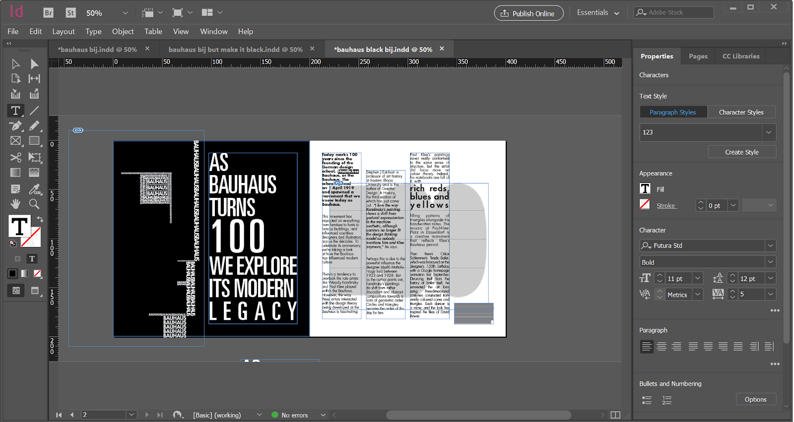
I decided to put this in the background of my second page so it sits behind my paragraphs. I think if it was a lighter grey it would look very subtle and nice against the texts.
I simply inserted the picture and lowered the opacity to get the effect that I wanted.
 |
| Fig. 1.12 Spread Screenshot |
After doing the designs, I finally arrived to the part I was completely lost about- expressing the text. I came up with almost 10 different layouts and arrangements for my paragraphs but they all seemed so out of place and awkward.
Throughout the whole process, I was just constantly changing my paragraph layouts. Eventually, I stuck to this layout in Fig. 1.13:
 |
| Fig. 1.13 Paragraph Layout: Close Up Screenshot |
I also struggled a bit doing the title- which actually was the LEAD-IN-TEXT and NOT the headline. Somehow, I have no idea how but, I completely disregarded the headline and solely worked on the lead-in-text and somewhere during the process I must have merged the two into one and just forgot, I guess. So far I have done 2 separate mistakes in a single project, but that's how it goes sometimes.
Fig. 1.15 is a full screenshot of my spread so far, with only the lead-in-text and no headline.
 |
| Fig. 1.14 Spread Screenshot: White Background |
 |
| Fig. 1.15 Spread Screenshot: Black Background |
Of course, I had to change it and include the actual headline. I made it in the same way (font, flush left alignment) as my previous attempt. I also made both black and white versions because I thought I could have more options to work with.
 |
| Fig. 1.16 Spread Screenshot: White Background |
After looking back at it, I felt like the justified alignment looked a bit weird when the rest are flush left. I changed all my paragraphs to be in a flush left alignment, excluding the last paragraph which will remain justified left.
I completely forgot about the minimum number of characters in a line and adjusted my paragraphs again as I had way too little to fit the minimum.
 |
| Fig. 1.17 Paragraph Screenshot |
I had to lower the font size and adjust the kerning too for the minimum number of characters (30-50) could fit my lines. Now it looks very small to me, and the layouts also changed so I have to arrange it again.
In Fig. 1.18 I played around with the positions of the paragraphs and made them going downwards. I think it looks interesting, except that it might seem like the Bauhaus movement is going 'downward' or is becoming irrelevant, which I do not agree to at all. From this, I figured to make it going in an upwards pattern instead.
 |
| Fig. 1.18 Paragraph Screenshot: Downwards |
 |
| Fig. 1.19 Paragraph Screenshot: Paragraph Going Upwards |
In Fig 1.19, I made the first column aligned start from the top margin. For Fig, 1.20, I lowered the first column and moved the second column slightly higher so that it goes in an increasing pattern.
I think the ascending pattern makes the overall text look more pleasing compared to going downwards. I also think it gives off a more positive message of the Bauhaus turning 100 and its movement to still be relevant.
 | |
|
I got feedback from Mr. Vinod and Mr. Shamsul to change a lot of things. Firstly, to make the Bauhaus emblem grey as it was too distracting. The giant '100' in the back needed to be removed too as it was also distracting. They were okay with my paragraph layout but I had to change my kerning and font size because it was very tight.
 | |
|
 | |
|
PDF of my final attempt:
| Fig. 1.23 Final Attempt: White Background PDF |
I liked how it tuned out, so I also wanted to make a black version just to see if it would be just as nice or perhaps even better.
 | |
|
 | |
|
PDF of my final attempt (black version):
| Fig. 1.26 Final Attempt: Black Background PDF |
Mr. Vinod and Mr. Shamsul went through my layout again and told me everything was okay. They only wanted me to increase the leading for the lead-in-text just a little bit. After I changed that, I added a 0.5 pt strokewidth border around the spread and printed it out.
 | |
|
 | |
|
FEEDBACK
Week 5: Specific feedback: Mr Vinod said that my Bauhaus emblem was too distracting and that I should make it grey instead of black. He and Mr. Shamsul also told me to remove the '100' in the lead-in-text as it was also too distracting. My headline was on the column interval, and they told me to move it because it was on the column interval and that it should stay mainly within the columns (a bit outside the lines is okay). They said that the emphasis on the '100' in the lead-in-text is unnecessary. My kerning was also too tight because I was trying to fit into the 35-50 character minimum on the line. They said that my ascending paragraph layout was okay. Other than that, I showed them my new type expression for 'explode' and they said that its good.
General feedback: Bodies of text in columns must be connected and linked; we cannot have different, unconnected bodies of text. The chances of accidentally deleting a word or sentence is very high when using separate bodies of text. The desired number of characters in a single line is 55-65 for larger columns, but it is okay to just use 35-50 characters for a small column. We must be careful of rivers when using justified text. To use both paragraph space and an indentation is unacceptable. Justified left with an indentation will look very raggedy, so the proper way to format this type of paragraph is to make sure both sides are even. Moving on, we do not need to make multiple files when doing different versions of our design; just add in more pages all within the same file. After getting our design approved, we must print it on an A3 sheet.
Week 6: Specific feedback: I told Mr. Vinod and Mr. Shamsul about how I separated my third column into three paragraphs because my 'rich reds, blues, and yellows' had a very large leading which cannot be changed without messing up the other paragraphs. Mr. Vinod said it was okay and just told me to increase the leading for the lead-in-text.
General feedback: After getting feedback for our final work, we would have to adjust it according to the feedback and then print it out in A3 paper with a 0.5 strokewidth around the border. Also, Mr. Vinod said that everyone should have a mouse. Mr. Vinod wanted to remind everyone again that we cannot have separate text boxes for each paragraph.
REFLECTION
Experiences:
Week 5 (25/08/19); We did not have a lecture today as everyone continued working on their project 1. It was pretty chill at the most; we were able to get feedback on our work and we could ask Mr. Vinod and Mr. Shamsul if we needed any more help. Week 6 (02/09/19); Today's class was really chill because Mr. Vinod and Mr. Shamsul were going around to check on everyone's project 1. Mr. Vinod started briefing us for our second project but he stopped himself and dismissed us half an hour earlier :').
Observations:
Week 5 (25/08/19); I noticed that a lot of people had very different layouts and compositions of their spreads. I think a large majority chose the "Designer's Code of Ethics" and "First Things First Manifesto 2000" compared to the Bauhaus article. There were also some layouts which looked quite familiar, too. Week 6 (02/09/19); There were a lot of people queuing up to print their spreads, so I should print it earlier to not waste time.
Findings:
Week 5 (25/08/19); I found that it is better to make many different versions of our work within the same file (InDesign) instead of making multiple files. This makes it so much easier to find all of my different attempts, even though I only have 2 variations of the same work, I probably have like 10 files in total. Week 6 (02/09/19); I found that the printer in the classroom was a bit of a hassle to use (it never sent me an email to get my pin number). I've always had problems with Taylor's printers in the past and I prefer to print at the purple room.
FURTHER READING
Typographic Systems by Kimberly Elam
(26/09/19 - 00/00/19)
 |
| Fig. 2.1 Typographic Systems Book Cover |
The 8 typographic systems are:
- Axial
- Radial
- Dilatational
- Random
- Grid
- Modular
- Transitional
- Bilateral
The Axial System aligns the design to the left and right of a single axis. Asymmetric arrangements are often more interesting than symmetrical ones, mainly because the composition becomes imbalanced when the axis is placed off center. Although asymmetric compositions are a visually simple arrangement, they hold more visual interest to the reader.
A Radial System has a central point of focus. All elements of this system extends outwards from a center point like rays. The compositions are dynamic and the eye is drawn to the focal point of the radial design. This design is highly symmetrical as it forms a circle, thus making them visually pleasing. Asymmetry in a radial system is 'less satisfying' but 'more visually interesting".
A Dilatational System forms a design along a circular path. Similar to the radial system, the compositions are dynamic because our eyes follow the along the curve of the circle.
The Random System has a spontaneous design. As the name suggests, it "has no definite aim, pattern, direction, rule, method or purpose." However, it is considered simple because the viewer is able to organize the composition even though it is unintentional. Cropping, overlapping, and odd angles add to the effect of randomness.
"Random placement often yields a very dynamic and spontaneous result that, although difficult to read, is visually satisfying"
The Grid System uses vertical and horizontal divisions in their design. These arrangements are seen as formal and intended to create visual order and economy in production. Information is placed in hierarchies and promote visual rhythm and consistency throughout multiple spreads.
A Transitional System as shifted bans and layers, which means elements are able to move left and right freely. Compositions are more casual than the grid system, and can be airy or widely leaded or tightly kerned to put emphasis on negative space.
A Modular System has standardized units, meaning that compositions are created by the organisation and placement of the modular units (building blocks, storage containers, and component systems). "The idea is to standardise the unit on which the typography rests and then compose the message with the modules".
Lastly, the Bilateral System consists of designs that are symmetrical to a single axis. These compositions are very symmetrical, thus making them predictable and potentially uninteresting.
 |
| Fig. 2.2 Axial System Example |
A Radial System has a central point of focus. All elements of this system extends outwards from a center point like rays. The compositions are dynamic and the eye is drawn to the focal point of the radial design. This design is highly symmetrical as it forms a circle, thus making them visually pleasing. Asymmetry in a radial system is 'less satisfying' but 'more visually interesting".
 |
| Fig. 2.3 Radial System Example 1 |
 |
| Fig. 2.4 Radial System Example 2 |
A Dilatational System forms a design along a circular path. Similar to the radial system, the compositions are dynamic because our eyes follow the along the curve of the circle.
 |
| Fig. 2.5 Dilatational System Example |
The Random System has a spontaneous design. As the name suggests, it "has no definite aim, pattern, direction, rule, method or purpose." However, it is considered simple because the viewer is able to organize the composition even though it is unintentional. Cropping, overlapping, and odd angles add to the effect of randomness.
"Random placement often yields a very dynamic and spontaneous result that, although difficult to read, is visually satisfying"
 |
| Fig. 2.6 Random System Example |
The Grid System uses vertical and horizontal divisions in their design. These arrangements are seen as formal and intended to create visual order and economy in production. Information is placed in hierarchies and promote visual rhythm and consistency throughout multiple spreads.
 |
| Fig. 2.7 Grid System Example |
A Transitional System as shifted bans and layers, which means elements are able to move left and right freely. Compositions are more casual than the grid system, and can be airy or widely leaded or tightly kerned to put emphasis on negative space.
 |
| Fig. 2.8 Transitional System Example |
A Modular System has standardized units, meaning that compositions are created by the organisation and placement of the modular units (building blocks, storage containers, and component systems). "The idea is to standardise the unit on which the typography rests and then compose the message with the modules".
 |
| Fig. 2.9 Modular System Example 1 |
 |
| Fig. 2.10 Modular System Example 2 |
 |
| Fig. 2.11 Bilateral System Example |


Comments
Post a Comment