Typography - Project 2

09/10/19 - 23/10/19 (Week 7 - Week 9)
Atiqah Farzana Binti Syalleh Karimyee (0336740)
Typography
Project 2
LECTURE NOTES
Week 7
(09/10/19)
Today we learnt the many technical terms to describe the specific parts of letterforms. There are way too many, so I would not write down all of them, but here are several which I think are most important.
 |
| Fig. 1.1 Anatomy of a Typeface |
The baseline is the imaginary line or the visual base of the letterforms.
The median is the imaginary line defining the x-height of letterforms.
The x-height is the height in any typeface of the lowercase 'x'. In Fig. 1.1, it is clear that the 'x' is exactly within the median and baseline.
 |
| Fig. 1.2 Stroke |
A stroke is any line that defines the basic letterform. When referring to any specific part of a letter without knowing the technical term, we are allowed to say "stroke". However, it is much more professional to refer to the terms properly.
The apex/ vertex is the point created by joining two diagonal stems. Apex is when it touches above and vertex when it touches below. In Fig. the 'A' has an apex on the top, whilst 'M' and 'V' have a vertex below.
 |
| Fig. 1.3 Apex/ Vertex |
The arm is the short strokes off the stem of the letterform, either horizontal (E, F, L) or inclined upward (K, Y).
 |
| Fig. 1.4 Arm |
The ascender is the portion of the stem of a lowercase letterform that projects above the median.
 |
| Fig. 1.5 Ascender |
The bowl is the rounded form that describes a counter; it can either be open or closed.
 |
| Fig. 1.6 Bowl |
The cross stroke is the horizontal stroke in a letterform that joins two stems together.
 |
| Fig. 1.7 Cross Stroke |
The cross bar is the horizontal stroke in a letterform that joins two stems together.
 |
| Fig. 1.8 Cross Bar |
The descender is the portion of the stem of a lowercase letterfrom that projects below the baseline.
 |
| Fig. 1.9 Descender |
The em/ en space refers to the width of an uppercase 'M', and it is used to know the distance equal to the size of the typeface. An en is half the size of an em.
 |
| Fig. 1.10 Em/ En Space |
Serifs are right-angled or oblique feet at the end of the stroke.
 |
| Fig. 1.11 Serifs |
A fun fact: The English alphabet originally had 27 letters- the last one being "&".
Uppercase and lowercase have the same characters. Small capitals are uppercase letterforms that fit within the x-height of the typeface. They are primarily found in serif fonts as part of what is often called expert set.
 |
| Fig. 1. 12 Small Capitals |
Uppercase numerals (also called lining figures) are the same height as uppercase letters are all set to the same kerning width.
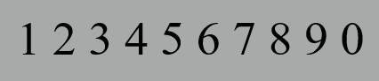 |
| Fig. 1.13 Uppercase Numerals |
 |
| Fig. 1.14 Lowercase Numerals |
Most fonts today are produced with a matching italic. Small caps are almost always only roman.
Punctuation and miscellaneous characters can change from typeface to typeface, so it is important to look at all the characters before choosing the appropriate type.
Roman letterforms are are called so because the uppercase forms are derived from inscriptions of Roman monuments. Book is a slightly lighter stroke in Roman.
 |
| Fig. 1.15 Roman |
Italics is named and based off of fifteenth century Italian handwriting.
 |
| Fig. 1.16 Italics |
Oblique is based on Roman form of typeface.
 |
| Fig. 1.17 Oblique |
Boldface has a thicker stroke than a Roman form; it is sometimes called "semibold", "medium", "black", "extra bold" or "super".
 |
| Fig. 1.18 Boldface |
Light has a lighter stroke than the Roman form, and even lighter strokes are called "thin".
 |
| Fig. 1.19 Light |
Condense is a version of the Roman form where the type is kerned tighter, and extremely condense styles are often called "compressed".
 |
| Fig. 1.20 Condense |
Extended is a variation of a Roman font.
 |
| Fig. 1.21 Extended |
 |
| Fig. 1.22 Typefamilies |
INSTRUCTIONS
Assignment brief:
Project 2 - Font Design
(Week 7 - Week 9)
09/10/19 - 23/10/19
We started off our project 2 with a lecture on the the technical terms for letterforms. We were given several letters to choose from to dissect- d, g, i, s, n, o, e, h, t, k, r- followed by and exclamation mark, a period and a comma.
 |
| Fig. 2.1 Dissection of Letters |
 |
| Fig. 2.2 Dissection of "d' |
 |
| Fig. 2.3 Dissection of "e' |
 |
| Fig. 2.4 Dissection of "k' |
 |
| Fig. 2.5 Dissection of "r' |
After we did our dissections, we had to show our sketches for our own fonts.
 |
| Fig. 2.6 Letterform Sketches 1 |
 |
| Fig. 2.7 Letterform Sketches 2 |
Upon showing it to Mr. Vinod, he said that the change was too simple and needed a standard "quirk" in all the letters.
Remembering that he said to make the change not too exaggerated or expressive, I made a new set of changes that were very subtle. As class had already ended, I sent it to him though Messenger.
 |
| Fig. 2.8 Letterform Sketches 3 |
This time Mr. Vinod said that it was too simple and that my change "lacked distinctiveness" and was not very "noteworthy" (his full remarks are in my feedback). It was true, though- I only made the corners rounded so it wouldn't be so sharp.
I was stumped between making a design that was subtle and a design that was distinctly expressive. I continued to sketch out more ideas until I was able to make something that fit the criteria.
 |
| Fig. 2.9 Letterform Sketches 4 |
After various ideas and sketches, I decided to add a serif to my letterform. In Fig. 2.10, I made my letterform have a triangular-shaped serif with a very narrow bowl. I think this change is much more distinct compared to my previous attempts.
 |
| Fig. 2.10 Letterform Sketches 5 |
 |
| Fig. 2.11 Letterform Sketches 6 |
I started with digitizing my new letterform design in Illustrator. I placed a picture of my sketch and lowered the opacity so I could trace/ form it better.
 |
| Fig. 2.12 Digitization: Illustrator |
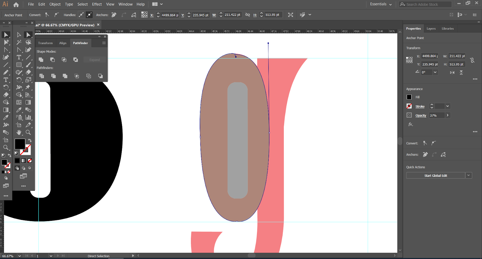
We were only allowed to use shapes to form the letters. We couldn't use lines or strokes. The stem of the 'd' is a rectangle, and then I added the triangles as serifs. I used the elipse tool to form the bowl so it is more oval shaped than a circle.
 |
| Fig. 2.13 Digitization: Shape Tool |
 |
| Fig. 2.14 Digitization: Serifs |
 |
| Fig. 2.15 Digitization: Forming the Bowl |
I struggled a lot with this letter in particular. Perhaps because it was the first one I did, and it also had a bowl which was very difficult for me to construct. In Fig. 2.14 I tried using the pen tool to shape it.
The feedback that I got for my letter 'd' was that the bowl had to be coming/ forming from the stem. My current letter 'd' looked a lot like the bowl and stem were just slightly touching each other which was a bad thing. I then fixed it as seen in Fig. 2.16.
 |
| Fig. 2.16 Digitization: Touchups |
I found that using the pen tool gave a much smoother end result so I decided to use it for my other letters.
 |
| Fig. 2.17 Digitization: Using Pen Tool |
 |
| Fig. 2.18 Digitization: Letter 'h' |
After doing some of the letters, it was clear that the same features could just be copy pasted for the rest of the letters. In Fig. 2.17 I used the stroke of the 'n' to form the same shape for the 'h'. In the same way, I used the 'd' for my 'g' as shown in Fig. 2.18.
 |
| Fig. 2.19 Digitization: Letter 'g' |
This is a screenshot of all of my 11 letters:
 |
| Fig. 2.20 Digitization: Finished Letters |
I was unable to export it because my ascenders and descenders were going out of the canvas, so I made a new template that was sightly bigger. I also made it wider so it could fit all 11 letters and the 3 punctuation marks too.
 |
| Fig. 2.21 Finished Letters and Punctuation Marks |
 |
| Fig. 2.21 Final Attempt |
 |
| Fig. 2.22 Fontlab Font Chart |
I inserted each letter in their respective boxes and lined them up against the grids as shown in Fig. 2.23 and Fig. 2.24.
 |
| Fig. 2.23 Fontlab: 'd' |
 |
| Fig. 2.24 Fontlab: 'g' |
 |
| Fig. 2.25 Fontlab: Font in a sentence |
I had to adjust the kerning and spacing so that it looks much more legible. Mr. Vinod said to keep all the left letter spacing to 0 and to only work with the right letter spacing. All the spaces are different and I had to work around trial and error to see what looks best.
After kerning everything, I generated my font and then installed it. There are some copyright marks on some of the letters because I am currently using a trial version of Fontlab, but they would not appear when I print it out (I hope).
 |
| Fig. 2.26 Fontlab: Installation |
 |
| Fig. 2.27 Illustrator: "god is in the kerning" |
 |
| Fig. 2.28 First Attempt: "god is in the kerning" |
With the help of a friend's laptop I managed to generate the font without any copyright marks.
 |
| Fig. 2.29 Fontlab: Installation 2 |
I had to arrange the words in a more unique manner and composition than the one before (as a lot of my other classmates had done the same composition). I decided to go with this one:
 |
| Fig. 2.30 Illustrator: "god is in the kerning" Attempt 1 |
 |
| Fig. 2.31 Illustrator: "god is in the kerning" New Composition |
 |
| Fig. 2.32 Illustrator: "god is in the kerning" Final Attempt |
Fig. 2.33 Illustrator: "god is in the kerning" Final Attempt PDF
FEEDBACK
Week 7: Specific feedback: Mr. Vinod said that I should have a standard "quirk" for all of my letters when designing it or else it will look very odd when placed together in a whole sentence (or a large body of text). For my second sketch, Mr. Vinod said "Yes I see that it is more rounded but, that feature isn't very note worth no? I want you to take a look at this senior students work... you can see the features he's trying to create are quite significant and distinct. Your attempt presently lacks distinctiveness."
General feedback: It is important to explain the picture/ design in the captions. PDFs are only necessary for the final design so our process attempts do not need to have PDFs (only JPEGs).
Week 8: Specific feedback: Mr. Vinod said that my design was very "eclectic", almost "borderline weird". Mr. Shamsul described it as retro-looking which was what I was going for. Mr. Vinod said that the "d" looks very isolated and that the circular stroke should go into the stem a bit more. The bowl should also be a bit closer to the stem.They didn't have any problems with the other letters and asked me to continue working on it.
General feedback: The images for your final project 1 is not in a very good quality. Poor lighting.
Week 9: Specific feedback: Mr. Shamsul commented on my 'o' because it is very narrow as I formed it the same as my 'd'. I purposely made it to match the 'd' while my 'e' is slightly bigger and wider. Both Mr. Vinod and Mr. Shamsul were okay with it as it had been done before in previous fonts too.
General feedback: Mr. Vinod said that Windows users have to use 'true type' when generating their font later on.
REFLECTION
Experiences:
Week 7 (09/10/19); Dissecting a letter for the first time was a bit difficult but it turned out to be easier than I thought. Altering a letterform also seemed to be easy, but it was not as it could not be too exaggerated or expressive, neither can it be too simple. Week 8 (16/10/19); I continued to struggle with making my letters with shapes. I kept having to change things because they didn't look smooth enough or curvy enough. Week 9 (23/10/19); A lot of people were absent today and for the most part the class was pretty chill. I'm usually stressed out before, during and after typo classes but this week was a good one.
Observations:
Week 7 (09/10/19); I noticed that a lot of people chose serif typefaces to dissect/ as their inspiration as compared to sans-serif types. My friend said that it's a lot easier to alter compared to a sans-serif mainly because theres a lot you can change with the serif. I think it all comes down to personal preference. Week 8 (16/10/19); Some of my friends preferred using the pen/ curvature tool instead of using shapes. It is a bit more difficult at first but I found that it gave a better and smoother outcome. Week 9 (23/10/19); I noticed that two of my letters were not showing up in my new metrics window when I typed it out. I later found out that this was because some of my anchor points were not connected properly.
Findings:
Week 7 (09/10/19); I think that the start of every project is always a bit of a struggle. I hope the workload becomes easier as time passes. Week 8 (16/10/19); I found that using the pen tool is easier than using the curvature tool, and gave out better results. Using basic shapes to construct a letterform was still a good move to make a foundation for the letter. Week 9 (23/10/19); After practicing for a while I realised that fontlab is not so difficult as I first thought it was. When I already knew what to do step-by-step I was able to follow through and create my own font.
FURTHER READING
The Thames and Hudson Manual of Typography by Ruari Mclean
(14/10/19 - 28/11/19)
 |
| 3.1 Front Cover |
 |
| 3.2 Back Cover |
This manual covers everything from the right furniture, stationary, lighting, and basic and special equipment that a typographer would need. Of course, these tips are more suited for professional typographers and not so much for amateurs or students. However, it is always insightful to learn early on on the things necessary to become a future typographer.
The three rules of legibility are:
1. Sans-serif type is intrinsically less legible than seriffed type.
Sans-serif types have some letters that are more like each other than seriffed letters, so the certainty of decipherment is diminished.
2. Well-designed roman upper- and lower-case type is easier to read than any of its variants, e.g. italic, bold, caps, expanded or condensed versions.
3. Words should be set close to each other (about as far apart as the width of the letter 'i'); and there should be more space between the lines than between the words.
Leading or 'interlinear spacing' is a vital factor in legibility because if it is too wide or narrow, the entire type will look off.
Typography by Gavin Ambrose and Paul Harris
(14/10/19 - 28/10/19)
 |
| 3.3 Front and Back Cover |
Typography will forever keep evolving to fit into trends, and essentially newer eras.
Type is used everywhere, from the pages of a book, on walls, floors, streets, to clothes and artworks. Every typeface has a different personality, so it is important for the typographer to consider the practical aspects of where the type will be used and how they will look like on different outputs. Some typefaces may look different on a smartphone screen as compared to on a printed brochure.
A typeface is a collection of characters, letters, numbers, symbols, punctuation (and so on) that have a distinct design.
A font is the physical means used to create a typeface, be it computer code, lithographic film, metal or woodcut.


Comments
Post a Comment