23/04/20 - 14/07/20 (Week 11 - Week 14)
Atiqah Farzana Binti Syalleh Karimyee (0336740)
Advanced Typography
Final Project
LECTURE NOTES
INSTRUCTIONS
Module Information Booklet:
EXERCISE
This final project required us to develop a font that is intended to solve a larger problem or meant to be part of a solution in the area of our interest be it graphic design, animation, new media or entertainment design or any other related area not necessarily reflecting our specialisation.
or
Explore the use of typeface in your area of interest, understand its existing relationship, identify areas that could be improved upon, explore possible solutions or combinations that may add value to the existing typeface.
Idea 1: Dyslexic-friendly type
There is an existing typeface called "Dyslexie" which was created to help dyslexic people be able to read better, almost 85% faster. The sagging bottoms of the letterforms anchor them visually, as a counterpoint to the tendency of letters to flip and move for dyslexic readers.
 |
| Fig. 1.1 The Dyslexie Font |
 |
| Fig. 1.2 The Dyslexie Font - A - Z |
Idea 2: Children's rug road map
The rugs in Fig. 1.3 and 1.4 act as a road map for young children to play with their toy cars, like in Fig. 1.5. If the roads in these rugs were in the form of letters, the children could be learning the strokes of letters in a fun and playful way.
 |
| Fig. 1.3 Road Rug 1 |
 |
| Fig. 1.4 Road Rug 2 |
 |
| Fig. 1.5 Child playing on road rug |
Idea 3: Metal band typeface
The typeface and logos used for metal rock bands are usually very illegible and they all look the same. I want to try to make a more readable typeface that would carry the same "vibe" to suit the metal band.
 |
| Fig. 1.6 Metal Band Logos |
Idea 4: Ambiguous-bubbly type
I saw these posters on Pinterest which use a bubbly, sort of oddly-shaped letterforms that range in legibility. The poster on the far left doesn't look like words (it's actually in Chinese) but you could just slightly make out the letterforms. As it progresses, the letterforms become more visible and has more of a defined shape to it. This type is different from the normal bubbly fonts so technically it's considered something new.
 |
| Fig. 1.7 Posters with Ambiguous-Bubbly Type |
After showing my ideas, Mr. Vinod and Mr. Shamsul told me to go ahead with my 3rd idea that is the metal band typeface. Mr. Vinod suggested that I should select a local metal band and work on their logo.
I went to do some research on Malaysian metal bands, however, there weren't that many to choose from. The band I ended up choosing is a Sabah group who call themselves "MANTAK" which means "ilmu hitam jahat" or "evil black magic" in the native Kedayan dialect of Borneo.
Their current logo represents heavy metal, but it's still quite illegible. I misread it as "MANIAK" the first time seeing it because the "t" in the middle is upside down, with a thinner stroke going across the other letters.
 |
Fig. 1.8 MANTAK Logo
|
I'd say their logo doesn't look as illegible as the ones in Fig. 1.6, but it could use some work. All of the sharp, jagged points are not uniform with each other. I understand that logos are focused more on the design, judging by how the "M" and "K" are larger with their strokes sort of contouring the word.
From their logo, I think the most prominent element would be the irregular, pointy thorns, along with how the ends of each stroke taper off (like a flame). I'd like to try to incorporate these elements into my new and improved version of their type.
Firstly, I started dissecting the logo for each letter.
 |
| Fig. 1.9 Dissection - M |
 |
| Fig. 1.10 Dissection - A |
 |
| Fig. 1.11 Dissection - N |
 |
| Fig. 1.12 Dissection - T |
 |
| Fig. 1.13 Dissection - A |
 |
| Fig. 1.14 Dissection - K |
I found that dissecting the letters was very difficult as the letters were not uniform. The curves were irregular and all over the place, same goes with the sharp edges.
Here are the sketches for my new typeface:
 |
| Fig. 1.15 Sketches 1 |
 |
| Fig. 1.16 Sketches 2 |
I used Futura Medium as a base to start off my font from there.
 |
| Fig. 1.17 Progress: M |
 |
| Fig. 1.18 Progress: A |
After doing both letters M and A, I continued to do all letters in the logo in the same style .
 |
| Fig. 1.19 First Attempt: M |
 |
| Fig. 1.20 First Attempt: A |
 |
| Fig. 1.21 First Attempt: K |
 |
| Fig. 1.22 First Attempt: N |
 |
| Fig. 1.23 First Attempt: T |
 |
| Fig. 1.24 MANTAK - First Attempt of logo |
After getting feedback from Mr. Vinod, he told me to make my letters to look more 'heavy metal', without focusing too much on the legibility.
I must admit, my letters don't look very 'metal' because I kept thinking too much about the legibility aspect of it. Mr. Vinod explained to me that the heavy metal genre is very specific and thrives on such illegible, unrefined type- therefore I shouldn't change it. Instead of changing the logo, he suggested I make a type based around the characteristics of the logo. This time I must keep in mind to add heaviness and weight to the letters and not make it so clean.
In addition to that, we were actually not allowed to use an existing type as a base for our font; we must construct it from scratch.
With all that in mind, I made some more sketches for my new type:
 |
| Fig. 1.25 Sketches 3 |
I uploaded Fig. 1.25 to Adobe Illustrator and used the pen tool to trace out the letters.
 |
| Fig. 1.26 Pen Tool Trace: M |
 |
| Fig. 1.27 Pen Tool Trace: A |
 |
| Fig. 1.28 Pen Tool Trace: E, random strokes |
From these strokes, I was able to make the complete alphabet. I only made uppercase letters because it suits the heavy metal theme more.
Here is the first set of letters:
 |
| Fig. 1.29 Second Attempt: All Letters |
 |
| Fig. 1.30 Second Attempt: All Letters (on Baseline) |
Close up of letters (A-G):
 |
| Fig. 1.31 Second Attempt: Letters A-G |
 |
| Fig. 1.32 Second Attempt: A |
 |
| Fig. 1.33 Second Attempt: B |
 |
| Fig. 1.34 Second Attempt: C |
Mr. Vinod suggested to add some weight to it so it looks stronger and more impactful on a poster. I made several letters a bit thicker to see how it looks like.
 |
| Fig. 1.35 Third Attempt: Letters A-J |
A few close up letters (A-G):
 |
| Fig. 1.36 Third Attempt: A |
 |
| Fig. 1.37 Third Attempt: B |
 |
| Fig. 1.38 Third Attempt: C |
Mr. Vinod and Mr. Shamsul still wanted it to be a bit thicker, however, because I did the strokes using the pen tool it would be difficult for me to increase the thickness. They were still fine with the current weight of the strokes, but it would be great if it could be slightly thicker.
The problem is that I couldn't simply make the outline thicker as the sharp edges will become dull. Therefore to add weight, I'd have to cut different strokes and enlarge/scale them. I figured since I've only added the thickness to several letters so far (A-J) I decided to redo them with even more weight.
 |
| Fig. 1.39 Progression of Weight |
The final attempt looked much stronger compared to the second attempt, so I continued to do all the letters and special characters in the same manner.
Here is the
final set of letters and special characters:
 |
| Fig. 1.40 Final Attempt: All Letters |
 |
Fig. 1.41 Final Attempt: All Letters (on Baseline)
|
 |
| Fig. 1.42 Final Attempt: Numbers |
 |
| Fig. 1.43 Final Attempt: Special Characters |
Fig. 1.44 Final Attempt: PDF (All Letters, Numbers and Characters)
After finishing all the letters and characters I could upload it to FontLab.
I made measurements in Illustrator so it would be more accurate when transferred to FontLab.
 |
| Fig. 1.45 Measurements in Illustrator |
 |
| Fig. 1.46 Measurements in FontLab |
 |
| Fig. 1.47 FontLab: A |
 |
| Fig. 1.48 FontLab: B |
 |
| Fig. 1.49 FontLab: C |
 |
| Fig. 1.50 FontLab: All Letters, Numbers and Characters |
 |
| Fig. 1.51 FontLab: Kerning Letters |
 |
| Fig. 1.52 FontLab: Kerning Numbers |
 |
| Fig. 1.53 FontLab: Kerning Special Characters |
While kerning, I encountered one problem where the forward-slash and backslash were not showing up on the new metrics window. I searched it up and found a few others with the same problem. I couldn't find the cause of it but the only solution is to type it out twice for the character will show up as shown in Fig. 1.49 (it's fine after I generated the font).
 |
| Fig. 1.54 FontLab: Kerning forward-slash and backslash
|
Finally, I had to think of a name to give my typeface.
The title "
Logam Berat" is directly translated from Bahasa Malayu which means "heavy metal". Since I used inspiration and references from Malay heavy metal bands, I thought it would be suitable for the name to be in Malay too.
I then generated the type and it was good to go.
 |
| Fig. 1.55 Logam Berat Generated |
Application:
Because I made the typeface for the band 'MANTAK', it's only natural that I use it for their collaterals.
I started off by looking at MANTAK's own collaterals such as album covers and posters to get a better feel of their aesthetic. Unfortunately, I was unable to find many posters or merchandise; I found a few album covers in the form of CDS, vinyls and even cassette tapes. I researched on similar bands of the same genre to see what their collaterals looked like.
 |
| Fig. 2.0 Reference: Poster 1 |
 |
| Fig. 2.1 Reference: Poster 2 |
 |
Fig. 2.2 Reference: Poster 3
|
 |
Fig. 2.3 Reference: Poster 4
|
 |
Fig. 2.4 Reference: Poster 5
|
 |
Fig. 2.5 Reference: Poster 6
|
From references in Fig. 1.51 to Fig. 1.56, I found that most of the posters place the band title/logo at the middle-top. The majority of the poster is occupied by a graphic illustration usually something edgy, maybe a bit gory, or even satanic.
I was a little uncomfortable with putting a satanic/demonic image in my poster so I was thought of using mythological creatures as the main illustration. I still felt very unsure and blurred on my direction so I went onto my favourite place to get ideas- Pinterest.
I found this particular image which struck me with some inspiration:
 |
Fig. 2.6 Image from Pinterest
|
After some research, I found that it is actually a painting by Bartolomeo Carvarozzi titled "Virgin and Child with Angels" and this is the full painting:
 |
| Fig. 2.7 Painting: Virgin and Child with Angels |
I jumped straight to Photoshop (without even sketching out my idea) because I already had a clear vision of what it looked like in my head.
 |
Fig. 2.8 Photoshop: Poster Process
|
 |
| Fig. 2.9 Photoshop: Fire Added |
 |
| Fig. 2.10 Photoshop: Skeleton Nun Added |
 |
| Fig. 2.11 Photoshop: MANTAK Logo and Details Added |
This is the final poster:
 |
| Fig. 2.12 Final Poster |
Fig. 2.13 Final Poster: PDF
 |
| Fig. 2.14 Final Poster: Application |
I wanted to make an album cover, too. Luckily, MANTAK has a few of their albums online which I used as reference.
 |
| Fig. 2.15 MANTAK - Album Cover 1 |
 |
| Fig. 2.16 MANTAK - Album Cover 2 |
 |
| Fig. 2.17 MANTAK - Album Cover 3 |
 |
| Fig. 2.18 MANTAK - Album Cover 4 |
I found the perfect vinyl record cover mockup because it already had a vintage feel to it. I immediately downloaded it and used my poster as the album cover.
 |
Fig. 2.19 Vinyl Cover: Progress
|
 |
| Fig. 2.20 Vinyl Cover: Poster Cover Added |
 |
| Fig. 2.21 Vinyl Cover: MANTAK Logo and Album Title Added |
The album title I chose to use was "Sabahell's Blasphemer" simply because I found it funny and creative out of their other album names.
I added stickers as a final touch, namely the explicit- parental advisory sticker, the price, and a random "F" sticker.
 |
| Fig. 2.22 Vinyl Cover: Stickers Added |
This is the final Album Cover:
 |
| Fig. 2.23 Final Vinyl Cover |
Fig. 2.24 Final Vinyl Cover: PDF
If I did the cover I realised I had to do the vinyl record, too.
I was unsure of the placement of text for the vinyl then I remembered that I could just take a look at my own vinyls.
 |
| Fig. 2.25 Vinyl 1 |
 |
| Fig. 2.26 Vinyl 2 |
Pretty much all of the vinyls have the same placements and format, no matter the genre of the album. I noted that the vinyl's text would consist of:
- Band and album title
- Record label/ copyright/ licensing
- Side 1/ side A or side 2/ side B
- Songs in order (may have time stamps)
- "Stereo" with some numbered code
- Usually a solid coloured background (could have an image similar to the vinyl cover)
Since most of the vinyls have the same placements, I added the text to the necessary places and it turned out looking similar to the references.
 |
| Fig. 2.27 Photoshop: Vinyl Record Process |
 |
| Fig. 2.28 Final Vinyl Record |
Fig. 2.29 Final Vinyl Record: PDF
This PDF contains both the album cover and vinyl:
Fig. 2.30 Final Vinyl Record and Album Cover: PDF
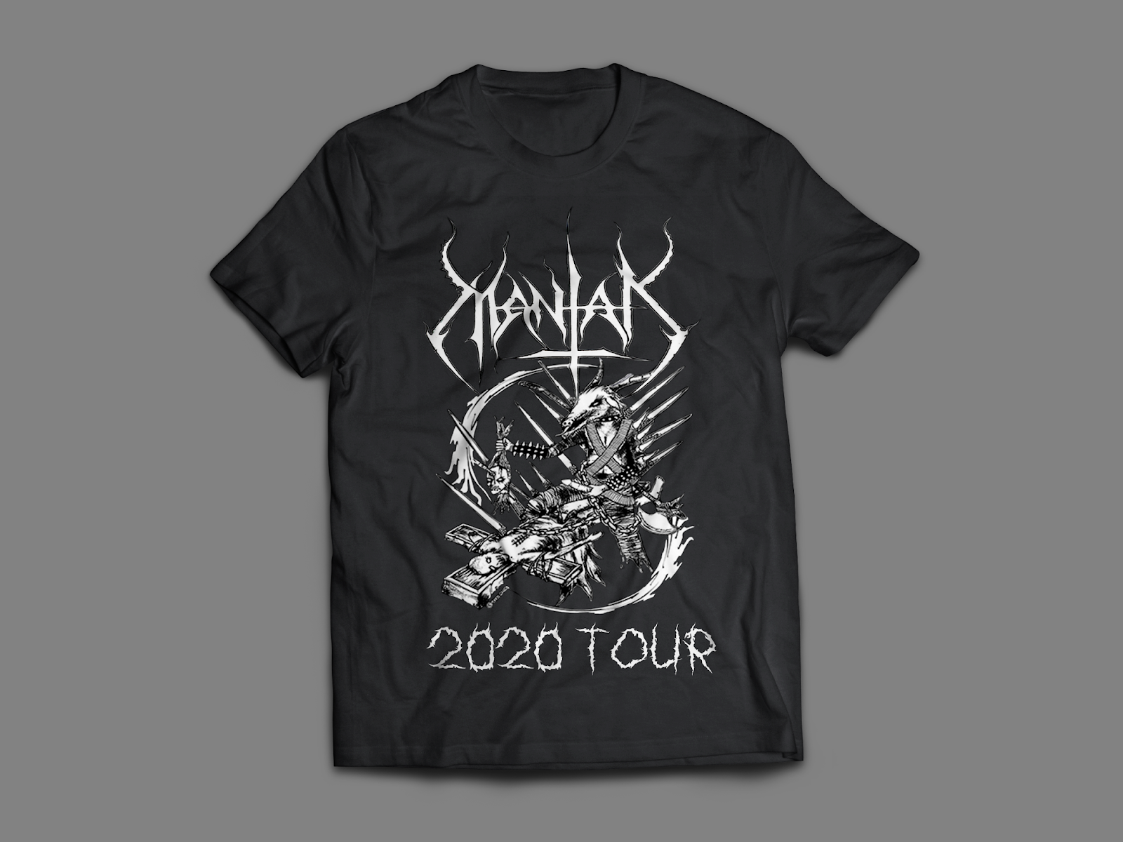
I found an illustration from the group MANTAK which would look good on a Tshirt, so I decided to edit one.
 |
| Fig. 2.31 MANTAK Illustration |
I used the selection tool to only select the graphic in the middle and placed it on the shirt.
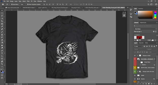 |
| Fig. 2.32 Tshirt: Graphic Added |
 |
| Fig. 2.33 Tshirt: Title and Tour Added |
This is the final shirt (front):
 |
Fig. 2.34 Final Tshirt (Front)
|
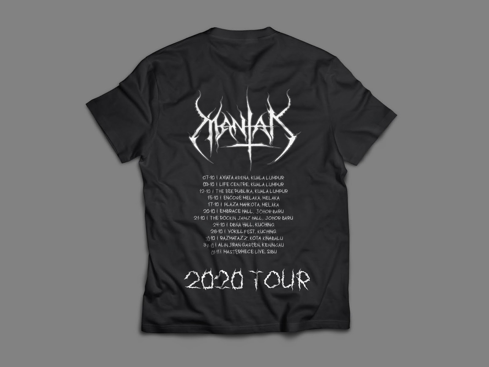
For the back, I wanted to put tour dates along with the band logo and "2020 Tour". I searched up popular concert venues in different states and cities in Malaysia and placed them with random dates as the tour.
 |
| Fig. 2.35 Closeup of Shirt |
This is the final shirt (back):
 |
| Fig. 2.36 Final Tshirt (Back) |
Fig. 2.37 Final Tshirt (Front & Back): PDF
Lastly, I made a few pins.
The first pin, Fig. 2.38 and 2.39, uses the poster/album cover with the same album name.
The second pin, Fig. 2.40 and 2.41, uses the graphic from the shirt along with the text "Eye of Deviant" which is also one of MANTAK's albums.
The third pin, Fig, 2.42 and 2.43, has of all their albums in red text as the background, and "MANTAK" is highlighted in white for contrast.
 |
Fig. 2.38 Pin 1: Flatlay
|
 |
| Fig. 2.39 Pin 1: Floating |
 |
| Fig. 2.40 Pin 2: Flatlay |
 |
| Fig. 2.41 Pin 2: Floating |
 |
| Fig. 2.42 Pin 3: Flatlay |
 |
| Fig. 2.43 Pin 3: Floating |
Final Compilation of collateral/applications:
 |
| Fig. 2.45 Final Compilation of Collateral/Applications |
This is the full compilation of the collateral/applications in PDF:
Fig. 2.46 Final Compilation of Collateral/Applications: PDF
FEEDBACK
Week 11:
General feedback: None.
Specific feedback: Other seniors have already done similar ideas to the dyslexic font. The problem with dyslexic fonts is that there's a particular way of it being designed and they all end up looking the same most of the time. (2nd idea - kids rug with road map) interesting idea, might hamper your ability to design something nice, forget about kids, la. When you design for kids often times it becomes something rudimentary and may not showcase your ability to the max. (3rd idea - metal band type) select a local rock metal band and redesign their logo for them.
Week 12:
General feedback: Absent
Specific feedback: (Facebook messenger) Don't try to redesign a metal typeface logo with the legibility aspect in mind, because heavy metal has a very distinct and specific genre/vibe. The legibility of their type suits their purpose, so dont try to change it. It must not look too taint and shart, try adding more heaviness to it.
(Redo version)
Can. Try outlining it a little to add weight to see whether it looks stronger for a poster. As it's a round type and not narrow/condesnsed. So it makes it less impactful if there's a lot of negative space. That's why I think if you can increase weight may work. To create more impact. But you see... if you think its ok as is, and you can envision how it looks in application andit seems possible to look good then go ahead. Looks on track to looking metal.
Week 13
General feedback: Remove the "lecture notes" in your blog if there were no lectures. Start thinking about the application and collaterals.
Specific feedback: On a poster, the amount of white space between letters may not create enough white space. If put together, it will look congested. To solve this she has created thicker strokes to lessen the white space. The collateral or promotional stuff can be used for flyers, posters, banners, social media posters, shirts, what they need before/after a show, tags etc. Keep in mind this is a display typeface so you can only use it for certain parts of the collateral that you create. Since it's a lot of work to make it thicker, then it is okay to stick with what you have and complete it. Complete all your letters today. Work full speed ahead. Once you've done that then start immediately thinking about your collateral. You have to make the collateral look really good, what you use and how you use the type in the collateral is going to be important.
Week 14
General feedback: Absent
Specific feedback: Absent, no feedback.
REFLECTION
Experience:
Week 11 (23/06/20); I had absolutely no idea what to do for this final project because the topic of finding a problem/solution was a bit difficult for me. The ideas suggested to me by friends and family did not excite me and I also found myself very stressed with all the other modules coming into the final project stage too.
Week 12 (30/06/20); (Absent).
Week 13 (07/07/20); I finally had a clear direction for my font and I felt like I finally knew what to do and was excited to finish up my font.
Week 14 (14/07/20); (Absent; struggling with all my modules so I had to skip this class to catch up with everything!)
Observation:
Week 11 (23/06/20); Some of my classmates have very solid and interesting ideas, so I felt a bit behind this time but that's how it is sometimes.
Week 12 (30/06/20); (Absent) I still found myself confused and my font wasn't really turning out the way I wanted it to. When told that I had to redo it, I was very upset, however the 2nd version of my work turned out much better!
Week 13 (07/07/20); Now that I have a clearer direction on what I want my font to look like, I take my time to construct them. The downside is that I'm much slower at doing my work when I want it to look exactly how I want it to.
Week 14 (14/07/20); Absent.
Findings:
Week 11 (23/06/20); I found it very difficult to think about a problem/topic to be solved. I didn't have an idea till the night before class and it was immediately rejected. Luckily I was able to have new ideas within class time and it was approved.
Week 12 (30/06/20); Absent.
Week 13 (07/07/20); I think I was working at an incredibly slow speed, in addition to having to balance other modules. I was surprised to see some of my classmates had already finished their entire alphabet with special characters too.
Week 14 (14/07/20); Absent.
FURTHER READING
Typo Tips: Seven Rules for Better Typography by Erik Spiekermann
(25/06/20 - 05/07/20)
 |
Fig. 3.0 Typo Tips Book Cover
|
[Click here to view the book!]1. Never use capital letters to accentuate or emphasise words in running copy. Use italics instead. If you must, use proper small caps with or without initial capitals. For example, the word "JPG" should use small caps in a sentence.
2. There are three different ways to connect or separate words: the hyphen, the en dash (wider than the hyphen), and the em dash (wider still). The em dash without space is used to separate thoughts-like this-but it may be a distribution in running text. Instead, use an en dash with one character space on either side - kinda like this - plus it looks better. En dashed without space are used for time, numbers or compound words.
3. Real quotes should look like similar to a "66" and "99". The straight quotation marks make it look unprofessional.
4. A ligature is defined as the visual or formal combination of two or three
letters into a single character. They consist of letter combinations such as
ff, fi, fl, ffi. Ligatures keep letters from overlapping and improve legibility.
For example: affluence, configure, deflate, affinity.
5. Justified
text often causes
unsightly rivers
in a block of text.
Try flush right
text instead.
6. Use bullets or centered points instead of hyphens (-) when you list items.


Comments
Post a Comment