Advanced Typography - Project 2

Atiqah Farzana Binti Syalleh Karimyee (0336740)
Advanced Typography
Project 2
LECTURE NOTES
INSTRUCTIONS
Module Information Booklet:
EXERCISE
Key Artwork and Collateral
(Week 9 - Week 10)
09/04/20 - 16/06/20
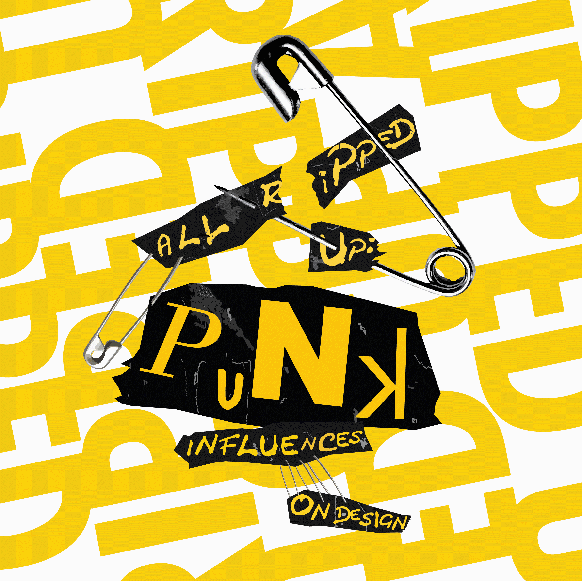
Using our key artwork, we had to make a poster, then move onto our collaterals.
I wanted to incorporate the torn paper effect into my posters as it ties in with the 'all ripped up" aspect of the title. Also, the safety pins in the key artwork could act as if they are holding the papers together.
 |
| Fig. 1.1 Poster - Idea 1 |
 |
| Fig. 1.2 Poster - Idea 2 |
Shying away from the rips, I wanted to make a bright and loud poster. I used the words "all ripped up" repeatedly to form a pattern as the background.
 |
| Fig. 1.3 Poster - Idea 3 |
This last one was just for fun as I already had 3 solid poster ideas. For a more messy, punk look, I used doodles and scribbles as a graphical element.
 |
| Fig. 1.4 Poster - Idea 4 |
Surprisingly, both lecturers liked 3/4 of the ideas and they asked me to choose which one I wanted to continue working on. I chose to go with Fig. 1.16 (idea 2), but Mr. Vinod suggested to make the grey into shades of off-white so the key artwork stands out better.
 |
| Fig. 1.5 Poster - Idea 5 |
After playing around with it, I didn't really like how it was turning out so I went back to my other designs.
Here are two more designs that are combinations of Fig. 1.17 and 1.18 with the paper rips:
 |
| Fig. 1.6 Poster - Idea 6 |
 |
| Fig. 1.7 Poster - Idea 7 |
Mr. Vinod suggested I change the black paper rips as it was too strong, and also move the placement of the text to the bottom yellow part of my background.
This is my final poster:
 |
| Fig. 1.8 Poster - Final Attempt |
Fig. 1.9 Poster - Final Attempt PDF
The e-invite is 200mm x 200mm, and we had to make it an animated GIF.
Here is my final static e-invite:
 |
| Fig. 1.10 E-invite - Static Final Attempt |
Fig. 1.11 E-invite - Static Final Attempt PDF
Here are the few animated GIFS that I made:
 |
| Fig. 1.12 E-invite - Idea 1 |
 |
| Fig. 1.13 E-invite - Idea 2 |
 |
| Fig. 1.14 E-invite - Idea 3 |
Mr. Vinod wanted to see how it would look like if I combined the moving background in Fig. 1.12 with idea 3 (Fig. 1.14) so I tried it out.
(If the gif is laggy, you can view it here)
 |
| Fig. 1.15 E-invite - Final Attempt GIF |
Collateral:


 |
| Fig. 1.19 Collateral - Flatlay |
Fig. 1.20 Collateral - PDF
FEEDBACK
Specific feedback: (First attempts) Both lecturers were fine with my 2nd, 3rd, and 4th posters but I had to only choose 1 to continue working on it. Mr. Shamsul liked the 3rd poster because of the string yellow/black contrast, however, I ended up going with the ripped one because I spent a lot of time on it. Make the tears more better, controlled, structured better. Use different shades of off-white with some noise to create a paper-like effect. You must add more details to the tears, or perhaps you can even tear off a newspaper and use it in your poster. Parts of different tears can hold the text. (2nd attempt but still unfinished) Keep working on the rips! The off-white makes the key artwork stand out more, but right now it looks like it's just floating on the pieces of ripped paper. The typeface is not working, you can try to use a more newspaper-like type. (3rd attempt) Might be better to not use black. Then the key artwork stands out. You can consider using another shade too. The issue now is the text name time etc, that I feel should be placed on the corners. Damn good work on the tear!!! So the copy which was earlier on the sides will now be where I indicated but dense, tight like your background yellow text only in black, explore, see where it goes.
Week 10: General feedback: The typeface for the text should be bigger because the e-invite is on a screen.
Specific feedback: Mr. Vinod liked my first idea because I kept the key artwork still. Mr. Shamsul said that it's not necessary to always animate the key artwork. They both liked my 2nd and 3rd ideas too. It's what us old folks used to call "cool beans"! Mr. Vinod suggested I combine the moving background with the rip in the 3rd idea. Portfolio - You must have two sperate posts for Project 1 (Key Art) Project 2 (Collateral).
REFLECTION
Experience: Week 9 (09/06/20); Making changes after getting feedback on something is very difficult to do in a short time-frame (to show after lunch break, to get more feedback out of it). Week 10 (16/06/20); Making the animation for this was quite reminiscent of one exercise in Typography where we had to animate our name :')
Experience: Week 9 (09/06/20); Making changes after getting feedback on something is very difficult to do in a short time-frame (to show after lunch break, to get more feedback out of it). Week 10 (16/06/20); Making the animation for this was quite reminiscent of one exercise in Typography where we had to animate our name :')
Observation: Week 9 (09/06/20); Some of my classmates didn't use any colour in the posters, but their outcomes were still nice. This showed me that colour doesn't necessarily make an artwork better, but oftentimes it can enhance it. Week 10 (16/06/20); I noticed that a lot of my classmates had used very different animation styles, making each e-invite look quite unique.
Findings: Week 9 (09/06/20); I think making a poster was much easier than making a key artwork. Week 10 (16/06/20); Simple animations can look just as nice and exciting as complex animations.
FURTHER READING
Butterick's Practical Typography by Matthew Butterick
(09/06/20 - 16/06/20)
 |
| Fig. 2.1 Butterick's Practical Typography Book Cover |
[Click here to view the book]
Typewriter habits that you should NOT do:
1. Straight quotes rather than curly quotes (see straight and curly quotes).2. Two spaces rather than one space between sentences.3. Multiple hyphens instead of dashes (see hyphens and dashes).4. Alphabetic approximations of trademark and copyright symbols.5. ellipses made with three periods rather than an ellipsis character.6. Non-curly apostrophes.7. Pretending that accented characters don’t exist.8. Using more than one word space at a time.9. Using tabs and tab stops instead of tables.10. Using carriage returns to insert vertical space.11. Using alphabetic characters as substitutes for real math symbols.12. Making rules and borders out of repeated alphabetic characters.13. Ignoring ligatures.14. underlining anything.15. Using monospaced fonts rather than proportional fonts.16. Abusing all caps.17. Thinking that the best point size for body text is 12.18. Ignoring kerning.19. Ignoring letterspacing.20. Too much centered text.21. Only using single or double line spacing.22. Only using the line length permitted by one-inch page margins.


Comments
Post a Comment