Publishing Design - Exercises

28/08/20 - 9/10/20 (Week 1 - Week 7)
Atiqah Farzana Binti Syalleh Karimyee (0336740)
Publishing Design
Exercises
LECTURE NOTES
Week 1: Formats
Mr. Vinod had previously recorded all the lectures for our convenience to watch anytime. The first lecture video is about 'formats'. Mr. Vinod explained about the different formats that have been used by different civilizations around the world, and how they have changed over time. The specific civilisations that were discussed were the Mesopotamian civilisation, Ancient Egyptian civilisation, Indus Valley civilisation, Han Chinese civilisation and European civilisation.
Week 2: History of Print
This lecture touched on the print history, how printing evolved over periods of time, and the various techniques involved.
AD - After Death (of Christ)
BC - Before Christ, no longer used because of its sectarian undertones, CE is used in replacement
CE - Common Era
BCE - Before Common Era
Week 3: Typography Redux
This lecture was essentially a recap of what we leant in our previous typography modules, just to brush up our knowledge on it. Legibility aspects were explained in detail, which would help us when formatting our text for our book.
Week 4: The Grid
"A well-executed design is one that works subtlety in the background and allows the work - on the pages - to do the talking; clearly; logically; with elegance or beauty."
The goal is to make the information easily digested by the reader, in visual terms. However, this has to be weighed with the beauty and surprising nature of the design. The layout should not be overpowering to the point that it takes away from the communication or understanding of the reader. At the same time, it should not be too rigid or boring, which may put off the reader. There must be a good balance.
Week 5: Elements
All publications consist of 3 major elements:
- Type
- Colour
- Image
Holding the above together is format and grid.
It is good to not fall into the trap of predictability. Hence, variation and randomness should be applied with caution. A surprising element is nice to have so readers will feel excited with every page. However, consistency should still be kept to maintain balance.
INSTRUCTIONS
Module Information Booklet:
EXERCISES
Book Mock-up Making and Content Generation
Week 1
(27/08/20)
Class was held on campus this week, so Mr. Vinod demonstrated how to make the mock-up book in person. For this exercise, we had to fold an A3 paper in half and come up with 3 different possible sizes that are smaller than A4, but bigger than A5. Mr. Vinod kindly provided us with A3 sheets of paper so that we can do the exercise in class.
The sizes I tested were:
- 250mm x 185mm
- 236mm x 17.4mm
- 220mm x 165mm
I went with 250mm x 185mm because I liked how square-ish and wide it felt.
 |
| Fig. 1.1 Book Mock-up Size Exploration | 28/08/20 |
 |
| Fig. 1.2 Final Cut-Out Sheet; 250mm x 185mm | 28/08/20 |
 |
| Fig. 1.3 Final Mock-up | 28/08/20 |
 |
| Fig. 1.4 Final Mock-up; Final Inside Page | 28/08/20 |
 |
| Fig. 1.5 Final Mock-up; Rubberband Binding | 28/08/20 |
 |
| Fig. 1.6 Final Mock-up; Flatlay | 28/08/20 |
 |
| Fig. 1.7 Final Mock-up; Flatlay | 28/08/20 |
 |
| Fig. 1.8 Final Mock-up; GIF | 28/08/20 |
Text formatting
We then needed content to put in our book. The write up should be a minimum of 3000 words, have a minimum of 3 chapters, 3/4/5 subtexts (sidebars) and one pull quote per chapter. Below is the draft for my 3000 words.
Fig. 1.9 Text Formatting; First Draft | 04/09/20
As we had to finish this writeup by the next week, I did it in a rush. I decided to redo it better, however, keeping the same topic and theme.
Fig. 1.10 Text Formatting; Second Draft | 04/09/20
By the end of the semester, my content went through a few adjustments along the way. Below is the updated and final version of the content.
Fig. 1.11 Text Formatting; Final | 17/11/20
Van de Graaf Grids
Week 1
(27/08/20)
 |
| Fig. 1.13 Van de Graff, JPEG | 11/09/20 |
 |
| Fig. 1.15 Van de Graff with grid over text, JPEG | 11/09/20 |
 |
| Fig. 1.16 Van de Graff with text, JPEG | 11/09/20 |
Signature Folding Systems & Grids
Week 2
(04/09/20)
 |
| Fig. 1.17 Signature Fold; Closed | 11/09/20 |
 |
| Fig. 1.18 Signature Fold; Opened | 11/09/20 |
 |
| Fig. 1.19 Signature Fold; Pages | 11/09/20 |
 |
| Fig. 1.20 Signature Fold; Unfolded (Front Side) | 11/09/20 |
 |
| Fig. 1.21 Signature Fold; Unfolded (Back Side) | 11/09/20 |

Fig. 1.22 Signature Fold; GIF | 11/09/20
 |
| Fig. 1.25 Spread Only | 11/09/20 |
 |
| Fig. 1.26 Grid System, with spread | 11/09/20 |
 |
| Fig. 1.27 Grid System, without spreads | 11/09/20 |
 |
| Fig. 1.28 Spread Only | 11/09/20 |
 |
| Fig. 1.29 Grid System, with spread | 11/09/20 |
 |
| Fig. 1.30 Grid System, without spreads | 11/09/20 |
 |
| Fig. 1.31 Spread Only | 11/09/20 |
 |
| Fig. 1.32 Grid System, with spread | 11/09/20 |
 |
| Fig. 1.33 Grid System, without spreads | 11/09/20 |
Week 3 (11/09/20)
Determining Grids; Form and Movement
Mr. Vinod explained a few of the features in InDesign, including bleed, slug, CMYK and pantone colours.
Bleed is the area at the edge of the page that will be trimmed. A 2-3mm bleed is necessary when printing, and the text or design must extend beyond this area, or else it may result in a white border when trimmed.
Slug is There are a few technical marks printed outside the document area, and these are important for high-quality printing. The slug are is just one of these optional page marks, located outside of the normal printing boundaries, and contains information about the printing job.
CMYK stands for:
- Cyan
- Magenta
- Yellow
- Black (K) [The letter k is used to avoid confusion with blue in RGB]
Pantone colours (a.k.a spot colours) are an addition to the CMYK colours, which totals to 5 colours.
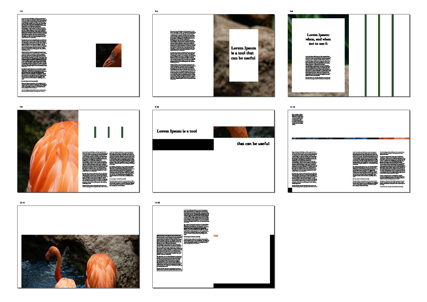
We then moved onto the exercise, which was about determining the grids for our chosen book size. Mr. Vinod kept emphasising that "margins determine the look and feel of your book." Thus, this exercise would help us in perfecting our margins.
Fig. 1.34 Determining Grids; spreads with text | 18/09/20
 |
| Fig. 1.36 Determining Grids; Spread 1 - text with margins | 18/09/20 |
 |
| Fig. 1.37 Determining Grids; Spread 1 - margins only | 18/09/20 |
 |
| Fig. 1.38 Determining Grids; Spread 2 - text with margins | 18/09/20 |
 |
| Fig. 1.39 Determining Grids; Spread 2 - margins only | 18/09/20 |
 |
| Fig. 1.40 Determining Grids; Spread 3 - text with margins | 18/09/20 |
 |
| Fig. 1.41 Determining Grids; Spread 3 - margins only | 18/09/20 |
Form & Movement Exercises
• 1 Colour
• 2 Colour
• 2 Colours + Image
• Colour + Image + Text
 |
| Fig. 1.42 Grids and Columns | 18/09/20 |
 |
| Fig. 1.43 Form and Movement; Spreads Attempt 1| 18/09/20 |
 |
| Fig. 1.44 Form and Movement; Spreads Attempt 1 GIF | 18/09/20 |
 |
| Fig. 1.45 Form and Movement; Spreads Attempt 2 | 18/09/20 |
 |
| Fig. 1.46 Form and Movement; Spreads Attempt 2 GIF | 18/09/20 |
 |
| Fig. 1.48 Form and Movement; Spreads Final Attempt GIF | 18/09/20 |
 |
| Fig. 1.50 Form and Movement; Colour Spreads Final Attempt GIF | 01/10/20 |
 |
| Fig. 1.51 Image 1 | 01/10/20 |
 |
| Fig. 1.52 Form and Movement; with Image - Attempt 1 | 01/10/20 |
 |
| Fig. 1.53 Image 1 | 01/10/20 |
 |
| Fig. 1.54 Form and Movement; with Image - Attempt 2 | 01/10/20 |
 |
| Fig. 1.55 Form and Movement; with Image - Final Attempt | 01/10/20 |
 |
| Fig. 1.57 Form and Movement; with Text - Final Attempt | 01/10/20 |
 |
| Fig. 1.58 Form and Movement; with Text - Final Attempt GIF | 01/10/20 |
FEEDBACK
Week 1:
General feedback: Update your blog and feedback sheet every week. Your blade needs to be really sharp so you won't have to be putting much pressure when cutting.
Specific feedback: Finish the book and mock-up and the Van de Graaf digital grid.
Week 2:
General feedback: The formatting of the first page, subtexts and pullquotes are as important as the content you write.
Specific feedback: Everything looks fine, make the references in APA style, try to reach 3000 words (if not then I'll only have around 28 pages, might have to compensate with larger images or so).
Week 3:
General feedback: Absent.
Specific feedback: Absent.
Week 4:
General feedback: Finish up the 16 visuals soon to get it over with. Remember that there are 3 levels of detail in design, and it's good to include all 3 or else we would use up a lot of time to get them done.
Specific feedback: Mr. Vinod was fine with my mood board and the art style I wanted to go for, however, commented that the more detail I put in, the more time and effort it needs.
Week 5:
General feedback: We should finish up the exercises by this week to get it over with to focus solely on the book.
Specific feedback: Mr Vinod was a bit thrown off by my first illustration because the mirror seemed distorted, so I decided to change it to a basic plain oval mirror instead. Other than that, my illustrations look so far so good and I should complete the remaining ones to make up 16 in total.
Week 6:
General feedback: The form and movement exercise with the image should be constructed in a way that the image builds up excitement and a surprising element for the reader. To do this, we shouldn't use up the whole picture immediately, but show only bits and pieces or details to gradually show the whole image.
Specific feedback: The first image I chose (colourful, psychedelic) was too loud and overly exciting, and doesn't give much room for the reader to be surprised when they turn the page. The second image (beige paint) was too plain and didn't have much variety in the image itself for a surprising element.
Week 7:
General feedback: There is no need to add both copyright word and symbol, can just choose either one.
Specific feedback: Mr. Vinod said the layout looks alright and I can carry on with the next chapter. He suggested to be more experimental with the layout and placement of illustrations can be more playful.
Experience: Week 1 (28/08/20); I was excited to finally be back on campus and have physical classes but then I remembered that in a few weeks time I would much rather want to just stay at home. Week 2 (04/09/20); I was a bit overwhelmed by the workload already, but I'll try my best to pull through. Week 3 (11/09/20); Making 16 illustrations seems alright but it really takes up a lot of time and effort, especially with other assignments at hand. Week 4 (18/09/20); Having class from 9 till 6 is kinda insane and I never wanna do it again :') Week 5 (25/09/20); The form and movement exercises seem so simple at first you feel like what you're doing is all good and correct but it almost never is (lmaoo). Week 6 (02/10/20); The form and movement exercises are getting harder with each added step but the exercises section is almost finished!
Observation: Week 1 (28/08/20); I noticed that this class was going to be really difficult as we were already getting into project 1 from the start, and because Mr. Vinod already warned us about the workload. Week 2 (04/09/20); I think this module has the most amount of work out of all my other modules, and because it's on a Friday, I always put off doing the work till the day before class. Week 3 (11/09/20); I think my time management this sem is either really really bad, or the workload is way too much :0 Week 4 (18/09/20); I was worried about not finishing all of my illustrations, but almost no one did more than 5 so I felt more relieved. Week 5 (25/09/20); Doing and re-doing the form and movement exercises makes me understand its principles better and how to see the transitions flow better. Week 6 (02/10/20); I think that choosing a good picture or even an illustration will really change how a layout looks.


- bring rhythm
- ensures balance
- reflect proportion
- offer consistency
- Proximity
- White space
- Alignment
- Contrast
- Repetition


Comments
Post a Comment