05/10/20 - 19/10/20 (Week 7 - Week 9)
Atiqah Farzana Binti Syalleh Karimyee (0336740)
Packaging and Merchandising Design
Project 2
LECTURE NOTESThe Role of Typeface in Packaging Design
Week 9 (19/10/20)
Module Information Booklet:
PROJECT
Project 2: Innovative Packaging
(Week 7 - Week 9)
05/10/20 - 19/10/20
For this project, we collaborated with 2 schools- The School of BioScience (SBS) and The School of Media in Communication (SOMAC). Our task is to create a packaging design for a selected product from SBS. The packaging should be able to communicate and be marketable in the local or international market. The design should communicate the benefit of the product and the brand of the product.
My group consisted of me, Dondo, and Angdio. We chose the chocolate team to collab with. Their product is described as 'milk chocolate and strawberry-filled smoked peanut cracker'.
Here are some information given by the BioScience students:
Fig. 1.1 Nutrition Facts
 |
| Fig. 1.2 Chocolate Information |
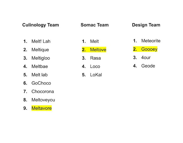 |
| Fig. 1.3 Chocolate Name Exploration |
In the end, we all settled for
'Meltove'.
After deciding the chocolate name, we then had to start thinking about the logo and packaging.
On week 8, we had a meeting with the other schools to discuss logo ideas. Each of us came up with 2 logos each, and here are my logo sketches:
 |
| Fig. 1.4 Meltove Logo - Sketch 1 |
 |
| Fig. 1.5 Meltove Logo - Sketch 2 |
|
 |
| Fig. 1.6 Meltove Logo - Digitisation |
|
Here are Angdio and Dondo's logos:
 |
| Fig. 1.7 Meltove Logo - Angdio's Attempt |
|
 |
| Fig. 1.8 Meltove Logo - Dondo's Sketch 1 |
|
 |
| Fig. 1.9 Meltove Logo - Dondo's Sketch 2 |
|
 |
| Fig. 1.10 Meltove Logo - Digitisation (Space Rationalisation) |
|
 |
| Fig. 1.11 Meltove Logo - Digitisation (Colour Scheme and Typefaces) |
 |
| Fig. 1.12 Meltove Logo - Progress |
The logos were further developed to have more of the 'chocolate' look and feel.
 |
| Fig. 1.13 Meltove Logo - Development |
|
| Fig. 1.14 Meltove Logo - Final PDF |
After finialising the logo, we could move onto the packaging. Firstly, we made a stylisation range finder to have a clearer direction of our packaging style. We chose a minimal abstract style for our packaging.
 |
| Fig. 1.15 Stylisation Range Finder |
|
 |
| Fig. 1.16 Original/Intended Packaging |
|
 |
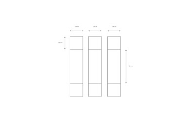
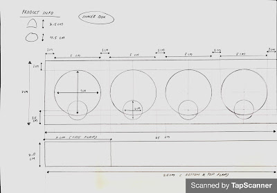
Fig. 1.17 Packaging Dieline 1
|
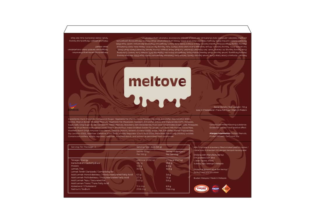
Along with the nutrition facts in Fig. 1.1, we also had to include these certified food logos on our packaging (excluding the Halal logo).
 |
| Fig. 1.18 Certified Food Logos |
 |
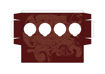
| Fig. 1.19 Packaging Design 1 |
 |
| Fig. 1.20 Packaging Design 2 |
 |
| Fig. 1.21 Packaging Design 3 |
 |
| Fig. 1.22 Packaging Design 4 |
 |
| Fig. 1.23 Packaging Design 5 |
 |
| Fig. 1.24 Packaging Design 6 |
 |
| Fig. 1.25 Packaging Dieline 2 |
 |
| Fig. 1.26 Packaging Dieline 2 - Inside Box |
 |
| Fig. 1.27 Packaging Dieline 2 - Dividers |
 |
| Fig. 1.28 Packaging Design 7 |
 |
| Fig. 1.29 Packaging Design 8 |
 |
| Fig. 1.30 Packaging Design 9 |
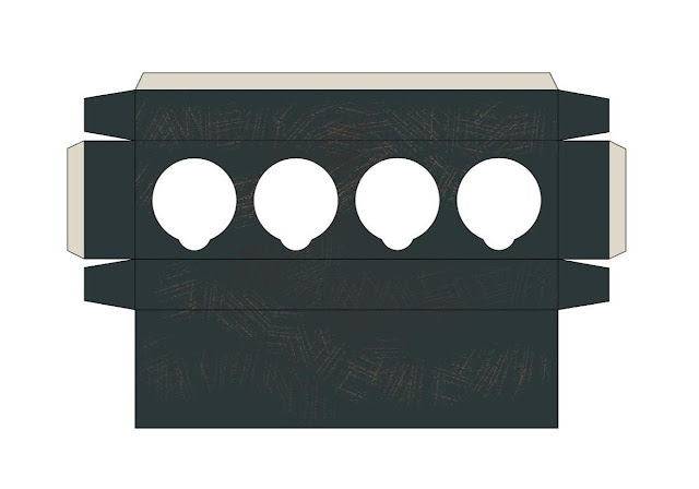
Here is the final packaging design:
 |
Fig. 2.1 Final Packaging Design
|
 |
| Fig. 2.2 Final Packaging Design - Inside Box |
 |
| Fig. 2.3 Final Packaging Design - Dividers |
Below is a prototype of the packaging. It is in a smaller size from the actual packaging because the printer cannot print the dieline bigger than A4.
 |
| Fig. 2.4 Prototype - Sketch |
 |
| Fig. 2.5 Prototype - Flatlay |
 |
| Fig. 2.6 Prototype - Assembling Progress |
 |
| Fig. 2.7 Prototype - Assembling Progress |
 |
| Fig. 2.8 Prototype |
 |
| Fig. 2.9 Prototype |
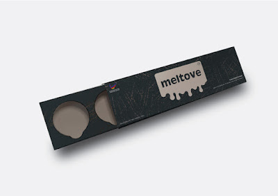
Here are the mockups of our final chocolate packaging:
 |
| Fig. 2.10 Mockup 1 |
 |
| Fig. 2.11 Mockup 2 |
 |
| Fig. 2.12 Mockup 3 |
 |
| Fig. 2.13 Mockup 4 |
 |
| Fig. 2.14 Mockup 5 - Chocolate on Shelf |
 |
| Fig. 2.15 Mockup 8 - Chocolate with Competitors |
 |
| Fig. 2.16 Final Chocolate Packaging |
 |
| Fig. 2.17 Final Chocolate Packaging Opened |
Here is a compilation of our progress that covers everything we did for this project:
Fig. 2.18 Final Project 2 Submission PDF


Packaging
ReplyDeleteand merchandising design play a vital role in creating a strong retail impact. I really like how effective packaging not only protects the product but also communicates the brand’s story, while merchandising enhances visibility and attracts customer attention. The combination of both creates a powerful shopping experience and influences buying decisions. Great insights on this topic!