Publishing Design - Project 2
02/10/20 - 30/10/20 (Week 6 - Week 10)
Atiqah Farzana Binti Syalleh Karimyee (0336740)
Publishing Design
Project 2 - Book Design
LECTURE NOTES
INSTRUCTIONS
Module Information Booklet:
Fig. 1.1 Layout References
Determined grids:
Fig. 1.2 Determined Grids
Grid options:
Fig. 1.3 Grid Options
Final chosen grid system:
 |
| Fig. 1.4 Chosen Grid |
Typeset:
After deciding on the grid layout, we then had to create a type specimen sheet to find the most suitable typepace for our book.
Type specimen sheet:
 |
| Fig. 1.5 Type Specimen Sheet |
Final Typeset:
Heading: ITC New Baskerville Bold All Caps, 20pt
Body text: ITC New Baskerville Roman, 9pt
Subtext: ITC New Baskerville Roman, 7pt
Pull Quote: ITC New Baskerville Roman/Bold, 24pt
Layout design:
Attempt 1:
 |
| Fig. 1.6 Layout Attempt 1 |
 |
| Fig. 1.7 Layout Attempt 1, with grids |
Attempt 2:
 |
| Fig. 1.8 Layout Attempt 2 |
 |
| Fig. 1.9 Layout Attempt 2, with grids |
Cover design:
Attempt 1:
 |
| Fig. 1.10 Cover Design Attempt 1 |
Final Attempt:
 |
| Fig. 1.11 Cover Design Final Attempt |
Fig. 1.12 Cover Design Final Attempt PDF
Final Book Layout Design:
 |
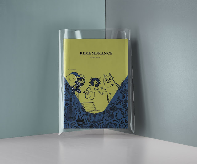
| Fig. 1.13 Final Book Design Cover |
 |
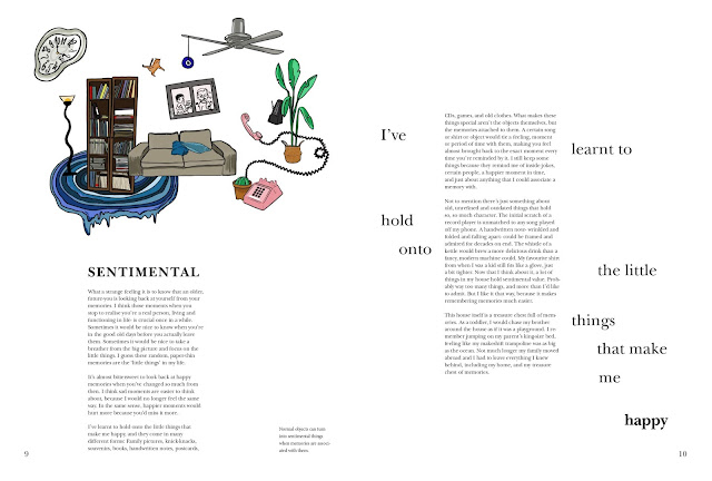
| Fig. 1.14 Final Book Design Spread |
 |
| Fig. 1.15 Final Book Design Spread |
 |
| Fig. 1.16 Final Book Design Spread |
 |
| Fig. 1.17 Final Book Design Spread |
 |
| Fig. 1.18 Final Book Design Spread |
 |
| Fig. 1.19 Final Book Design Spread |
 |
| Fig. 1.20 Final Book Design Spread |
 |
| Fig. 1.21 Final Book Design Spread |
 |
| Fig. 1.22 Final Book Design Spread |
 |
| Fig. 1.23 Final Book Design Spread |
 |
| Fig. 1.24 Final Book Design Spread |
 |
| Fig. 1.25 Final Book Design Spread |
 |
| Fig. 1.26 Final Book Design Spread |
 |
| Fig. 1.27 Final Book Design Spread |
 |
| Fig. 1.28 Final Book Design Spread |
 |
| Fig. 1.29 Final Book Design Spread |
 |
| Fig. 1.30 Final Book Design Spread |
 |
| Fig. 1.31 Final Book Design Spread |
Final Book Design Thumbnail:
Fig. 1.32 Final Book Design Thumbnails PDF
Final Book PDF:
Fig. 1.33 Final Book Design PDF
Final Book Link:
https://online.fliphtml5.com/kyzjs/aamx/#p=1
Fig. 1.34 Final FlipBook Design
Final book mockup:
 |
| Fig. 1.38 Final Book Mockup 4 |
 |
| Fig. 1.39 Final Book Mockup 5 |
Specific feedback: My first layout reference looks good because it suits the illustration style of the book, but it might not suit my book because of my art style. I should try to find other layout references that would be better for my book. For my book layout, I initially wanted my body text to be placed in the centre of the page but I figured that it would look like a poem. Mr. Vinod said its good I didn't do that because it wouldn't work out. He helped fix up my layout and placement of text and illustrations, and that I should try a more experimental approach with the book because we could have fun with it.
Week 7:
General feedback: There is no need to add both copyright word and symbol, can just choose either one. Body text should be 8-12pts and our leading should be 2.5-3 points from point size. Subtexts are usually 7pt and pullquotes should be bigger than the body text.
Specific feedback: Mr. Vinod said the layout looks alright and I can carry on with the next chapter. He suggested to be more experimental with the layout and placement of illustrations can be more playful.
Week 8:
General feedback: Independent learning week.
Specific feedback: Independent learning week.
Week 9:
General feedback: Mr. Vinod decided to scrap out the animation of the visuals so that we could have more time for our BCI project.
Specific feedback: Everything looks good so far and I'm almost close to finishing it. Just add a neutral colour for some pages, fix up the ragging/orphans/widows, add the reference page, and lastly the cover.
Week 10:
General feedback: The barcode should just be really small with a 2-3mm white space around it.
Specific feedback: Add a white border around my barcode, and I can also put in the price of the book with the barcode. I used a light pink as my neutral shade in some pages of my book but Mr. Vinod said it could work but wasn't really suitable.
In the video, the designer explains that a book cover is acts as a first impression to the reader, so it should hook them into picking up the book and reading it. A book cover is a form of visual storytelling and there are many ways to create the perfect cover.
Different designers have different ways of working. A good way to know the book is to actually read it and understand the tone, story, and how it can be portrayed visually. The target audience should also be considered, as well as the deeper meaning or concept behind the design and how it correlates back to the story.
This article revolves around designer Peter Mendelsund who has made over 600 book covers in his lifetime, with big-name contemporary releases like The Girl With the Dragon Tattoo. He was deemed the best book designer of his generation, despite not having any design experience whatsoever. Mendelsund said that he prefers an ugly cover to a cliche one, which reflects in his own work. His style is never the same. Sometimes his covers are bold, abstract and unexpected, while other times they are utterly simple, cryptic yet clever. One thing is his designs are never familiar.
A good book cover is one that captures the book inside it in some fundamental and perhaps unforeseen way. Mendelsund describes his job as 'finding that unique textual detail that...can support the metaphoric weight of the entire book." This of course is done by actually reading the manuscript to understand the story, the details and further meaning of it.


Comments
Post a Comment